Window and Showcase Staging: Focal Order, Layers and Breathing Room橱窗与展柜的摆台节奏:主次、层次与留白
The window is the “face of the face” of a jewellery store: when passers-by stop for three seconds, they are looking at the window; after entering, the first thing they see is the showcase that extends from it. Yet many stores fill their windows to the brim, trying to highlight everything and remembering nothing - blurred focus, flat layering, no room to breathe. Window and showcase staging is, in the end, a balance of three things: focal order, layers and whitespace. Get all three right and you need no new goods or pricier props - the window gains a “cinematic” feel and passers-by slow down.
Focal order: one window tells one story
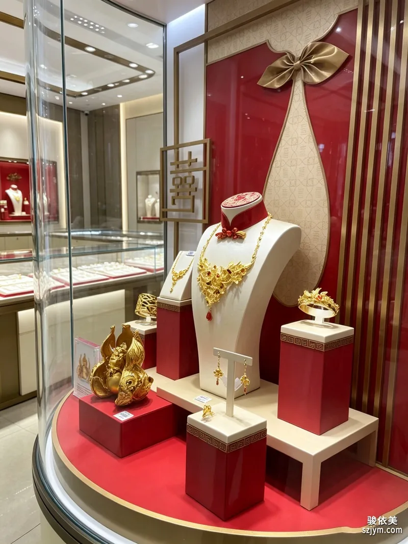
Stage with focal order first. One window, one showcase, one visual focal point: that piece is the protagonist and everything else serves it. Choosing the protagonist is simple - pick the piece you most want to sell this season, or the one that best represents the store, and place it at visual centre or the golden section, emphasised with an independent base, tray or back panel. Supporting pieces (same series, matching pieces) sit at the sides or behind, two or three at most, lower than the protagonist; decorative elements (velvet, florals, gift boxes, brand cards) only add atmosphere and must never steal the scene. There is a blunt test: stand in front of the window, close your eyes, open them - whichever piece your eyes land on first is the protagonist; if you first notice the flowers, the boxes or the lighting, the subject is buried and needs adjusting immediately.
Layers: fore, middle and back scenes for depth
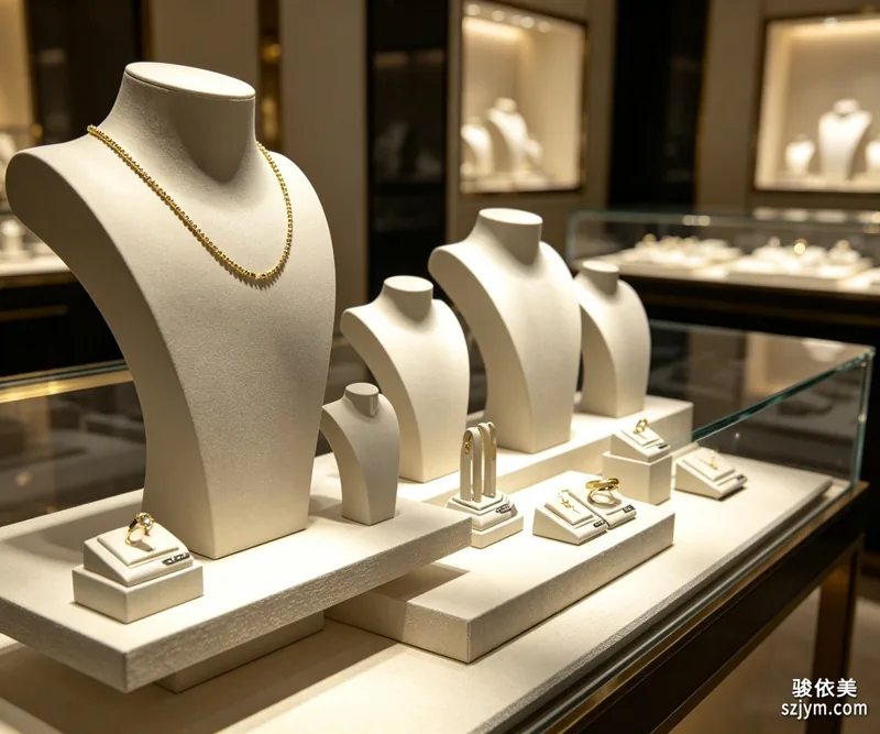
A good window is not “laid out on one plane” but has three layers: front, middle and back. The front layer holds low small pieces or props - ring trays, small ornaments - adding depth of field; the middle layer is the protagonist zone at the most visible height and position; the back layer uses back panels, mirrors or vertical display stands so the subject “jumps out” of the background. Height differences between the layers matter: front lowest, middle highest, back as transition, forming a sightline moving from bottom to top and near to far. The same logic applies inside showcases: flat trays at the base, upright displays in the middle, hanging or angled pieces on top - with layers separated, customers feel the “near, middle, far” spatial sense even through glass. One reminder: mirror back panels enlarge the space but also enlarge mess - make sure the cabinet is tidy first, or the mirror reflection will betray every detail.
Whitespace: showing less actually looks more premium
Whitespace is the most advanced technique in jewellery display and the hardest, because it is counter-intuitive. Many operators worry that whitespace means fewer goods and lower sales; in fact, the opposite is true. Jewellery is a high-price, low-frequency purchase - customers buy “value”, not “quantity”. Leave blank space, give goods room to breathe, let each piece be viewed alone, and perceived value rises; full coverage reduces every piece to background wall and looks cheap. How much whitespace? A rule of thumb: use only 60-70 per cent of the display area in showcases and windows, leaving the rest blank; within one visual zone, if more than three similar pieces appear, reduce the count; for small items in trays, prefer one piece per cell with two or three empty cells rather than packing solid. On lighting, give the blank areas attention too - place a soft beam in the empty zone so the “emptiness” itself becomes a design element; much of a window’s premium feel comes from exactly this.
Get focal order, layers and whitespace all right, and the window becomes the store’s best advertising: it costs no ad budget yet makes passers-by remember the store and walk in. Every season change or new arrival, restage by these three steps: set the protagonist first, arrange the layers, then courageously leave whitespace. After staging, step back three metres outside the store and inspect with a customer’s eyes - wherever it is messy, crowded or busy, adjust on the spot. Stage the window like a work of art, and customers will vote with their feet. Shenzhen Junyimei focuses on jewellery display and counter props, offering window showcases, display stands, trays, back panels and light boxes as a complete display set, and welcomes custom consultations based on store needs.
Staging is not a one-time job: change the theme each season, and make minor adjustments before new arrivals and holiday nodes so the window always feels fresh. After each staging, photograph it for reference - theme, goods structure and light positions - and compare on the next change: which combinations sold, which arrangements held customers longer. Over time, every store develops its own staging playbook.
Original article by Junyimei (lbobo.com). Reprints welcome; please credit the source. Professional display props: https://www.lbobo.com
橱窗是珠宝门店的“门面里的门面”:客人路过时停留三秒,看的就是橱窗;走进店后看的第一眼,还是橱窗延伸出来的展柜。可很多门店的橱窗摆得满满当当,件件都想突出,结果没有一件被记住——主次模糊、层次平铺、连一丝喘气的空间都没有。橱窗与展柜的摆台,说到底是三件事的平衡:主次、层次与留白。把这三件事做对了,货品不用换、道具不用加价,橱窗立刻有了“大片感”,客人路过也会放慢脚步。
主次:一个橱窗只讲一个故事
摆台先立主次。一个橱窗、一个展柜,只设一个视觉焦点:这件货品就是主角,其他一切都为衬托它服务。确定主角很简单——拣本季最想卖、最能代表店铺风格的那一件,放在视觉正中或黄金分割点,配独立底座、托盘或背板强调;配角(同系列、可搭配的货品)在主角两侧或后方,数量控制在两三件以内,高度低于主角;装饰元素(丝绒、花材、礼品盒、品牌卡)只作氛围点缀,绝不允许抢主角的戏。判断主次是否成立有个笨办法:站在橱窗前闭眼再睁开,第一眼落到哪件货上,哪件就是主角;如果第一眼看到的是花、是盒子、是灯光,说明主体被埋没,需要立刻调整。
层次:前中后三景,让橱窗“立体”
好的橱窗不是“摆在一张平面上”,而是有前、中、后三个层次。前景放低矮的小件或道具,如戒指托盘、小摆件,增加画面纵深;中景是主角区,放在最显眼的高度与位置;背景用背板、镜面或竖式展示架衬托,让主体从背景中“跳”出来。三个层次之间要有高差:前景最低、中景最高、后景作为过渡,形成从下往上、由近及远的视线动线。展柜内部同理:底层平放托盘、中层立式展示、上层吊挂或斜插,层次拉开,客人隔着玻璃也能感受到“远中近”的空间感。特别提醒:镜面背板虽能放大大空间,但也会放大杂乱,使用前先确认柜内货品足够整齐,否则镜中倒影会出卖一切细节。
留白:少摆一点,反而更贵
留白是珠宝陈列最高级的技巧,也是最难做到的——因为它反直觉。很多经营者担心留白显得货少、营业额下降,实际上正相反:珠宝是高单价、低频率的商品,客人买的不是“多”,而是“值”。留出空白,货品与货品之间有呼吸,每件货才能被单独注视,价值感随之提升;满铺反而让每件货都沦为背景墙,显得廉价。留白的度怎么把握?一个经验值:展柜与橱窗的货品总量,只用到陈列面的六到七成,其余留白;同一视觉区域内,超过三件同类型货品就要考虑减量;托盘里的小件,宁可每格放一件、空两三格,也不要塞满。灯光上,留白处也值得用心——在空白区域打一束柔光,让“空”本身成为设计元素,橱窗的高级感往往就来自这一点留白。
主次、层次、留白,三项都做对,橱窗就是门店最好的广告:它不花一分广告费,却能让路过的客人记住这家店、走进这家店。建议门店每次换季或上新时,都按这三步重新摆一次台:先定主角,再排层次,最后狠心留白。摆完之后退到店外三米,用客人的眼光检查一遍——哪里乱了、哪里多了、哪里杂了,当场调整。把橱窗当作品来摆,客人自然会用脚步投票。深圳骏依美专注珠宝陈列与柜台道具,可提供橱窗展柜、展示架、托盘、背板、灯箱等全套陈列配套,欢迎结合门店实际需求咨询定制。
摆台不是一劳永逸:建议每季换一次主题,新货到店、节日节点前各做一次微调,让橱窗始终有新鲜感。每次摆台结束,拍一张照片存档,记录主题、货品结构与灯光位置,下次换季时对照复盘——哪些组合卖得好、哪些摆法客人停留久,久而久之,每家店都会沉淀出一套属于自己的摆台经验。
原创声明:本文由深圳骏依美(lbobo.com)原创,欢迎转载,请注明出处。专业珠宝陈列道具,欢迎咨询:https://www.lbobo.com