Why Your Box Must Speak the Local Tongue珠宝包装的方言课
You ship a best-selling red-and-gold gift box from Shenzhen to Dubai, and it may never make it onto the counter. You take the minimalist white box that sells in New York and place it in a Shanghai store, and older customers quietly cool toward it. Going global in jewelry is tested first not by gold price or craft, but by whether the packaging can "speak the local dialect." In 2025, China's jewelry exports reached USD 50.6 billion, up 41% year on year — and more brands are discovering, for the first time, that the box has to be redesigned for each market's temperament.
Q1: Why does the same piece need a rewritten package per market?
A: Because the growth is real and sudden. According to the China Jewelry Association's 2025 industry report, China's jewelry exports hit USD 50.638 billion, up 41.33%, with trade to the Middle East reaching USD 1.366 billion, up 38.5% (exports USD 718 million). In cross-border e-commerce, gold and jewelry sales reached RMB 59.62 billion, with the US taking 44.3%. Bigger market, bigger cultural traps. A Western brand once launched a pure-white box on a white background — minimalist premium that killed it in New York and London — and underperformed badly in Shanghai, where white is the color of mourning. Cross-cultural color mismatch creates "disfluency," a subtle sense that something is wrong, which research shows can cut purchase intent by 15-25%, entirely below conscious awareness. Going global is not translating the text on the box; it is redesigning a visual language the local eye reads as natural. That is why leading houses now treat jewelry packaging localization as seriously as assortment.
Q2: Color is the first minefield — how different are markets really?
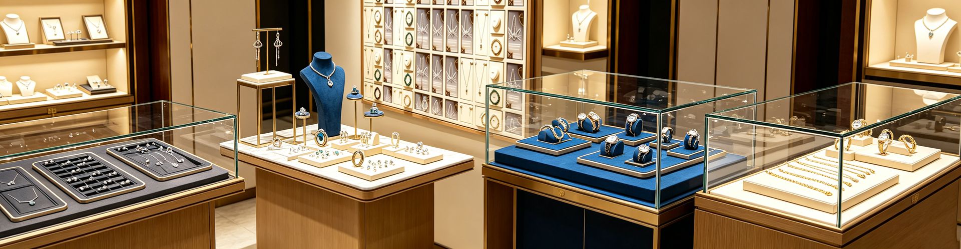
A: Different enough to sink a launch. In China, Japan and Korea, red means celebration, prosperity, Lunar New Year and weddings. In South Africa, red is the color of mourning. White signals purity and weddings in the West but mourning across much of East Asia; in parts of Latin America, purple carries mourning associations and yellow can signal illness. In the Middle East and Islamic cultures, green is sacred — tied to paradise and the Prophet — blue is protective and spiritual (the evil-eye amulet is blue), and gold signals luxury and hospitality. Joe Hallock's cross-22-country study found that even blue, the world's most liked color, carries wildly different associations, with cultural response-time gaps of 150-300 milliseconds — faster than conscious thought. The practical upshot: the same logo on a red box may read as "danger" in the Gulf, on a white box as "inauspicious" in Shanghai. Packaging is not an art direction question; it is a cultural one.
Q3: Beyond color, do size and hand shape need localization too?
A: Absolutely, and ring size is the hard proof. Industry sizing data: average women's ring size in the US and Canada is about US 6-7 (inner diameter 16.5-17.3 mm), in Japan only 4-5 (15.6-16.5 mm), noticeably slimmer; the Middle East runs roughly European 52-54, India 5-6, and East Asia (excluding Japan) about 4.5-5.5. That means the same ring needs a ring-cushion in Tokyo and Riyadh that differ by two or three sizes. Deeper still are taste and wear habits: Gulf consumers favor heavier, more substantial gold and are shifting toward lighter, Western-style minimalism among the young; Asian city women prefer slim stacking pieces. So the inner cushion of the jewelry box, the ring-pillow diameter, even the opening angle of the display insert, should follow the primary market. One ring sold worldwide, but only one box size stocked, is effectively locking half the customers out of trying it on.
Q4: Does premium minimalist packaging actually read better across cultures?
A: It does, and it explains why minimalism is the safe card for Chinese brands going abroad. Ornate packaging leans on dragons, phoenixes, specific religious motifs, national symbols — any of which can offend or simply become indecipherable noise in another culture. A solid color with a matte finish and one clean mark is close to a universal "Esperanto" every market accepts. Minimalism moves the budget from surface symbols to structural tolerance: fold edges under 0.2 mm, hinge life, liner fit — hard metrics that are difficult to copy and culturally unassailable. More pragmatically, when a brand is still unsure of a new market's taboos, fewer symbols means fewer landmines. A factory confident enough to put a minimalist box across many countries draws its confidence not from pattern but from tolerance — exactly why a supply chain like Shenzhen Junyimei invests in structure: it bakes cultural risk into the box's physical specs in advance.
Q5: How do religion, numbers and gifting taboos land in the packaging?
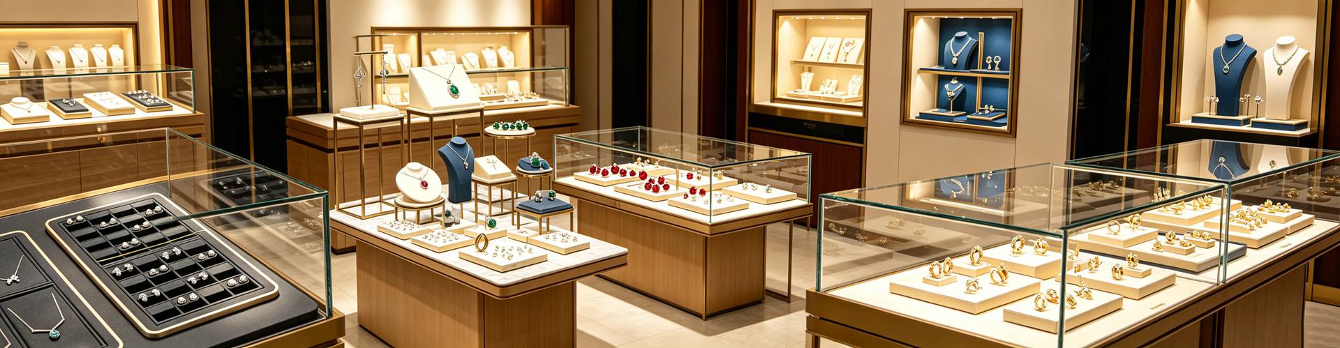
A: One by one. In the Middle East, green is usable but religious symbols — a six-point star, for instance — can drag in political and religious friction, so avoid when unsure; gifting gold at weddings and religious festivals is seen as auspicious, so the package must look "gift-worthy and dignified." Back in East Asia, the number 4 sounds like death and 8 like fortune, a clock as a gift implies "attending a funeral"; in India, red marks weddings. In execution: keep price tags, barcodes and promo stickers off the box face (discreet, no revealed value), seal the invoice and warranty separately; use an opaque, reusable jewelry pouch that protects both the suspense and the dignity. None of this is superstition — it is the local "buying common sense." Packaging that respects it makes customers feel "this brand gets me."
Q6: How can smaller brands localize on a budget?
A: You do not need a new mold per market. The cheapest move is one box architecture with swapped color, mark and liner size: gold-and-green restraint for the Gulf, red-and-gold festivity for East Asia, black-gold or pure-white minimalism for the West — the structure stays identical. Make certificates and warranty cards multilingual, and when you do jewelry box customization, reserve a regional slot and a fixed certificate pocket so the box becomes an archive you can pass on. The steadier rhythm is to concentrate on one market first, validate feedback, then scale — a jewelry box factory like Shenzhen Junyimei supports small-batch flexible production, letting you swap a colorway and prototype a few hundred pieces before a full rollout, far lower risk than a one-shot global launch. Localized packaging for export is not a one-time project; it is a system you keep updating against the market map.
This is original content. Copyright belongs to Shenzhen Junyimei.
Junyimei — present every jewel and timepiece at its best.
你在中国卖得顺手的红金礼盒,漂洋过海到了迪拜,可能连柜台都上不去;你在纽约走惯的极简白盒,摆回上海,长辈顾客心里先凉了半截。珠宝出海,最先被检验的不是金价和工艺,而是包装会不会"说方言"。当中国珠宝出口额在2025年冲到506亿美元、同比大涨41%,越来越多的品牌第一次发现:盒子,得按市场的脾气重新做一遍。
Q1:为什么同一件珠宝,到了不同市场包装要重写?
A:因为增长真的来了,而且来得猛。中宝协《2025中国珠宝行业发展报告》显示,2025年我国珠宝行业出口额达506.38亿美元,同比增长41.33%;其中对中东地区的进出口总额13.66亿美元,同比增长38.5%,出口7.18亿美元。跨境电商里金银珠宝类销售额596.2亿元,美国市场占了44.3%。盘子大了,文化坑也多了。一个西方品牌曾在中国用纯白盒配白底拍极简大片,在纽约伦敦大卖,到了上海却明显水土不服——在东亚传统里,白色是丧事的颜色。跨文化色彩错位会带来"不流畅感"(disfluency),研究指出这种无意识的违和能让购买意愿下降15%到25%。所以出海不是把中文盒子换成英文,而是重新设计一套能被当地人一眼读顺的视觉语言。这也是为什么越来越多品牌把珠宝包装的本地化,提上了和选品同样重要的位置。
Q2:颜色是第一个雷区,各市场到底差在哪?
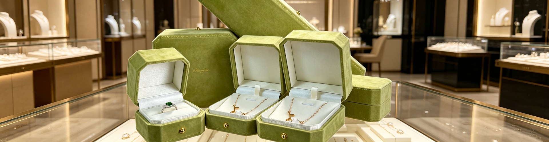
A:差到能直接翻车。在中国、日本、韩国,红色是喜庆、兴旺、春节和婚礼的主色;但在南非,红色是丧服的颜色。白色在东亚传统里关联哀悼,在西方却是婚纱与纯洁;在部分拉美市场,紫色关联哀悼,黄色在某些地区关联疾病。到了中东和伊斯兰文化圈,绿色是神圣之色,关联天堂与先知,蓝色是护身与灵性的颜色(邪恶眼护符就是蓝色),金色则代表奢华与好客。Joe Hallock 横跨22国的色彩研究发现,连"蓝色"这样全球最受欢迎的颜色,各地联想也天差地别,文化联想的反应时差可达150到300毫秒——比 conscious 思考还快。结论很直接:同一枚 logo,配红盒进中东可能被认为"危险",配白盒进上海可能被认为"不吉利"。包装不是美术题,是文化题。
Q3:除了颜色,尺寸和手型也得本地化?
A:必须。戒指圈号就是最硬的证据。行业尺码数据:美国和加拿大女性平均戒指尺寸约美码6到7(内径16.5到17.3毫米),日本女性仅4到5(15.6到16.5毫米),更纤细;中东大致沿用欧码52到54,印度5到6,东亚(除日本)约4.5到5.5。这意味着同一枚戒指,销往东京的戒枕和销往利雅得的戒枕,内径要差出两三号。更深层的是审美与佩戴习惯:中东消费者偏好更重、更显份量的金饰,年轻人也转向轻量与西式简约;亚洲都市女性更爱纤细叠戴。于是首饰盒的内衬、戒枕直径、甚至展示托的开口角度,都得跟着主销市场调。一个卖全球的戒指,盒子却只备一个尺寸,等于主动把一半顾客挡在试戴门外。
Q4:高端简约包装,在跨文化上反而更抗误读?
A:这话成立,而且刚好解释了为什么极简是中国品牌出海的安全牌。繁复包装爱用的龙凤、特定宗教纹样、民族符号,在他文化里要么踩雷、要么变成看不懂的噪音;而纯色哑面加一枚干净标识,几乎是所有市场都能接受的"世界语"。极简把预算从表面的文化符号挪到结构公差上:折边小于0.2毫米、铰链寿命、内衬贴合度,这些硬指标仿冒难抄、文化也挑不出刺。更现实的是,当品牌还摸不清某个新市场的忌讳时,少放符号就是少踩雷。敢把极简盒摆上多国柜台的工厂,底气不在花纹,在公差——这也正是深圳骏依美一类供应链愿意把功夫下在结构上的原因:把文化风险,提前做进盒子的物理指标里。
Q5:宗教、数字、送礼禁忌,怎么落进包装?
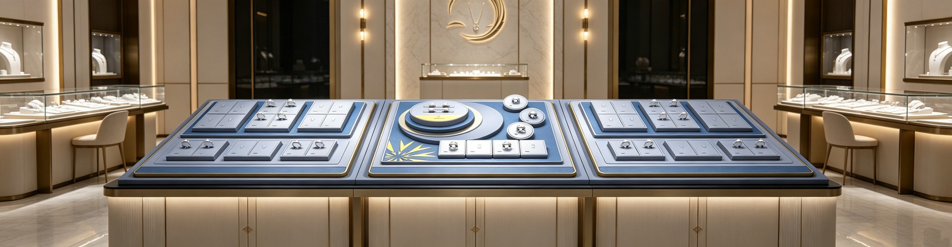
A:一条一条对照。中东市场,绿色可用但要慎重对待宗教符号,六角星等图案容易卷入政治宗教情绪,能避则避;送礼上,中东婚庆和宗教节庆赠金被视为吉祥,包装要做得"送得出手、撑得起场面"。回到东亚,数字"4"谐音不吉、"8"谐音发财,钟表作礼有"送终"联想;印度婚庆用红。落到执行:价签条码优惠贴纸别留在盒面(discreet 不露价),发票保单另封;不透光、可复用的首饰袋,把悬念和体面一起保住。这些不是玄学,是当地的"购买常识"——包装顺着它,顾客才觉得"这牌子懂我"。
Q6:中小品牌怎么低成本做本地化?
A:不必为每个市场开新模。最省的做法是同盒型换色、换标识、换内衬尺寸:主销中东的走金绿克制配色,主销东亚的走红金喜庆,主销欧美的走黑金或纯白极简,盒身结构可以完全一致。证书、保卡做成多语种,珠宝盒定制时预留区域位和证书固定位,盒子就成了一份可传的档案。更稳的节奏是先集中打一个市场、跑通反馈再放量——深圳骏依美这类珠宝盒工厂支持小批量柔性生产,几百只就能换一套配色打样,先试水再铺开,比一次性全球铺货的风险小得多。出海的包装,不是一次性工程,而是一套跟着市场地图持续更新的系统。
本文为原创内容,版权归深圳骏依美所有,转载请注明出处。
骏依美——让每一件珠宝与腕表,都被更好地呈现。