The Floor Plan That Quietly Closes the Sale动线决定谁成交
You think customers come to "browse." In truth, the moment they step through the door, the next three meters of their path are already written — most retailers just never treat that path as a selling tool.
Q1: Why do shoppers walk straight through without buying?
A: It usually starts at the doorway. Retail anthropologist Paco Underhill, after thousands of hours of store video, found the first 5–15 feet inside an entrance is a "Decompression Zone": light, temperature and scale are all changing, the brain is still downshifting, and nobody is actually looking at merchandise yet. His rule is blunt — never put high-value goods in that zone, because no one sees them.
In right-hand-traffic countries like China and the US, about 90% of shoppers reflexively turn right on entry (the "Invariant Right"). That right-hand wall can drive up to 30% of a store's total engagement, while the left "dead zone" sees roughly 40% less foot traffic. For a jeweler, the decompression zone should breathe — not be crammed with sale tags and foil-stamped boxes. Hero pieces belong on the right-hand power wall, at eye level (1.2–1.6 m). Shoppers average about 22 minutes in-store per visit, and each extra minute of dwell correlates with roughly 1.3% larger basket — but dwell only happens once the path is right.
Q2: How do you build a "golden path" that walks the whole store?
A: The most reliable layout is a loop (the "racetrack"): enter right, sweep to the back, return left to exit — maximizing exposure. Studies show loop layouts create about 28% more impulse purchases than straight aisles, and the "golden triangle" (entrance–hero zone–checkout loop) extends average dwell by about 4.2 minutes. Yet 80% of shoppers decide within 60 seconds of entering.
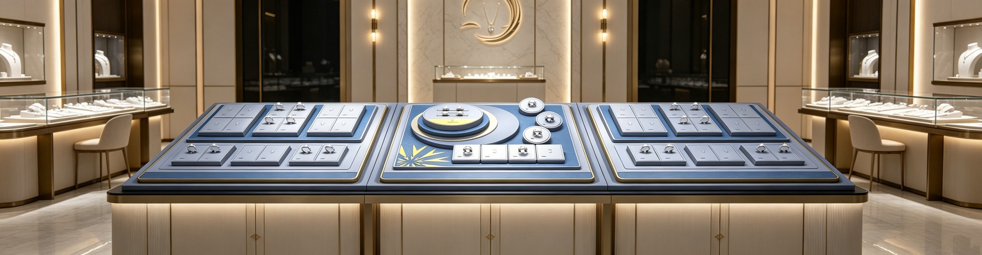
Height matters numerically: goods at 1.2–1.6 m are reached about 5x more often than those at the bottom. Step display heights down — 1.5 m at the entrance for impact, 1.2 m mid-floor for interaction, 0.9 m deep for intimacy. Use jewelry display props and display stands as "magnet points" along the path to pull people deeper; place destination items at the far end as anchors that force maximum walk-through.
Q3: How do you turn a stop into an "experience island"?
A: The path brings them; the stop sells. The numbers are clear: a custom showcase lifted time-at-counter from 18 to 31 seconds, "please let me try it on" requests from 12% to 27%, and browse-to-purchase conversion from 6.4% to 10.3%. One luxury jewelry project, after upgrading its displays, went from 4 to 11 minutes of dwell, 28% to 67% try-on conversion, and roughly +38% monthly sales. Every extra ~30 seconds of dwell lifts closing odds by about 8–12%.
The move is to plant "experience islands" on the path — try-on tables, mirror stations, interactive displays — that convert "passing" into "pausing." A jewelry bust shouldn't just hold the piece; it should invite touch and close inspection. Shenzhen Junyimei specs its props as path nodes, not isolated objects, so every stop has a story to tell.
Q4: Why does premium-minimal packaging win on the move?
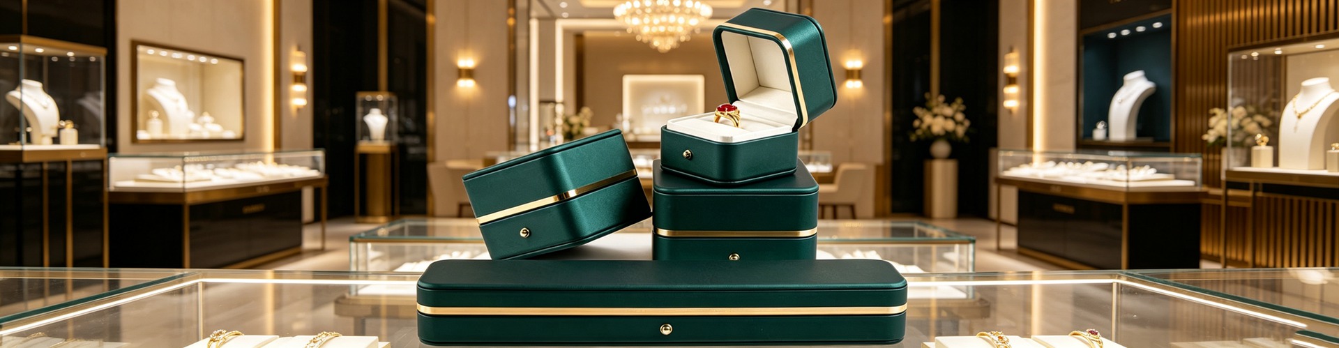
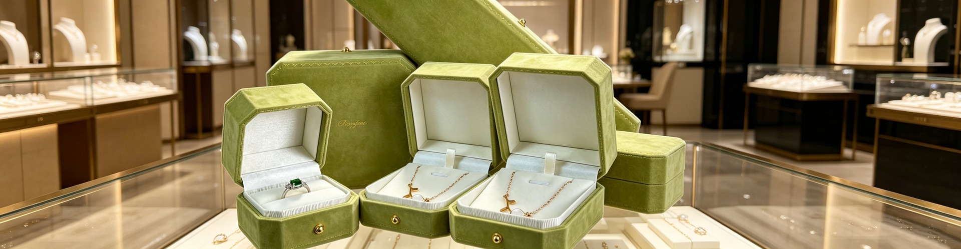
A: Because path shoppers "watch while walking," reading with peripheral vision — not stopping to study. The brain processes visuals about 60,000x faster than text, and judges color about 150 ms before reason engages. On the move, packaging is a moving billboard that must be recognized in half a second. Full-foil, dense patterns blur into noise at walking speed; a solid matte color with one clean mark is readable five meters away, in motion.
That is the path-based case for "premium-minimal wins": busy boxes create visual noise and get skipped; minimalism moves budget from surface print to structural tolerance, letting the jewel be the hero. Research backs it — in roughly 73% of categories, packaging color outweighs shape, size and material in influence, and color alone can raise brand recognition by up to 80%. On the path, every exhibit should be the thing looked at, not the box that hogs the frame.
Q5: How can a small store punch above its weight with layout?
A: Not by remodeling — by three cheap levers. One: move hero pieces to the right-hand power wall instead of piling them at the door. Two: keep the entrance clear, and put add-on items plus an opaque, reusable jewelry pouch at the path's end to extend exposure after they leave. Three: use one high-recognition display stand as a "landmark" that pulls people deeper.
One overlooked trap is aisle width. Underhill's "butt-brush" effect shows female shoppers leave after being jostled just 2–3 times. Keep aisles at least 1.1–1.2 m (about 3.5–4 ft). Place jewelry boxes and packaging samples by the try-on table to spark add-on sales — layout and packaging are the same spatial language.
Q6: How do you know the path actually works?
A: Measure the heat. A Shanghai lifestyle store used AI heat-mapping and found 62% of shoppers naturally drifted along the right-side curved aisle; it reshaped new-arrival cases into a figure-eight loop with floor LED guidance, lifting hero exposure by 300%. A Ginza jewelry store narrowed case spacing from 1.2 m to 0.8 m with mirror depth, and at a walking speed of
Stores can track three KPIs: entry-to-purchase rate (a benchmark can move 35% to 52%), average dwell, and attach rate. Plan the path, jewelry display props and packaging as one system — more stable and cheaper than tweaking displays in isolation. That is exactly what Shenzhen Junyimei recommends: display, packaging and flow should never be planned apart.
This is original content. Copyright belongs to Shenzhen Junyimei.
Junyimei — present every jewel and timepiece at its best.
你以为顾客是来“逛”的,其实他一只脚迈进门,未来三米内的路线就已经被你写好了——只是大多数人从没把这条“路”当成成交工具。
Q1:为什么客人走进来却“直穿”不买?
A:问题常出在门口那几步。零售人类学家 Paco Underhill 跟踪数千小时店内视频后发现,人从街道迈进店内的头 5–15 英尺(约 1.5–4.5 米)是“缓冲带”(Decompression Zone):灯光、温度、空间尺度全在变,大脑还在“减速”,根本没开始看货。他给客户的铁律是——绝不要把高价值商品放进缓冲带,因为没人会看见。
在靠右行驶的国家(中国、美国),约 90% 的顾客进门后本能右转(Invariant Right),右侧第一视觉区能贡献门店高达 30% 的关注度;而左侧“死区”客流比右侧少约 40%。对珠宝店来说,缓冲带该留白、做呼吸感,而不是把特价款、满版烫金的礼盒堆在门口抢戏。主推款应落在右侧“黄金墙”与视线 1.2–1.6 米的黄金带。数据显示顾客每次到店平均停留约 22 分钟,每多停留 1 分钟,篮值平均提升约 1.3%——路走对了,停留才发生。
Q2:“黄金路径”怎么布,才让客人走完全场?
A:最稳的是“回形动线”(racetrack):从右侧进、绕到深处、再回到左侧出口,保证顾客暴露给最多货品。研究显示回形比直线布局多创造约 28% 的随机消费;“黄金三角”(入口—主推区—收银台闭环)能让平均停留延长约 4.2 分钟,而 80% 的顾客在进店 60 秒内就做了购买决定。
具体落位有数:视线高度 1.2–1.6 米的商品触达率是底层货品的约 5 倍;陈列高度从入口 1.5 米、中部 1.2 米到深处 0.9 米递减,形成“先冲击、再互动、后亲密”的节奏。用珠宝陈列道具和珠宝展示架在路径上做“磁石点”(视觉亮点),把客人往里拉;深处放目的性强的款当“锚点”,逼出最大步行面积。
Q3:停留点怎么变成“体验岛”?
A:路只是把人带过来,留人才是成交。数据很直观:定制展柜把顾客在柜前的停留从 18 秒拉到 31 秒、主动请试戴率从 12% 升到 27%、浏览到购买转化从 6.4% 升到 10.3%;某高端珠宝项目升级展陈后,停留 4 分钟→11 分钟、试戴转化 28%→67%、月销约 +38%。每多停留约 30 秒,成交概率提升约 8–12%。
做法是在动线关键节点设“体验岛”:试戴台、镜前区、互动陈列,把“路过”变成“停下”。首饰展台不该只是托货的架子,而要成为可触摸、可细看的体验节点;深圳骏依美提供的展示道具,正是按“动线节点”而非“孤立摆件”来配套,让每个停留点都有说故事的支点。
Q4:为什么高端简约的包装,在动线上更容易被青睐?
A:因为动线上的顾客是“走着看、余光扫”,不是驻足细读。人脑处理视觉比文字快约 6 万倍、对颜色的判断约 150 毫秒就先于理性——包装在动线上其实是“移动广告”,得在半秒内被识别。满版烫金、细密印花在快走中是一团糊,争不过背景;而纯色哑面加一枚干净标识,五米外、走动中都能被认出。
这正是“高端简约更受青睐”的动线解释:繁复盒子在路径上制造视觉噪音,反被略过;简约把预算从表面花纹挪到结构公差,让珠宝当主角。研究也印证——在约 73% 的品类中,包装颜色对决策的影响权重超过形状、尺寸与材质;色彩本身就能把品牌辨识度最高拉到 80%。动线上的每一件展品,都该是“被看的对象”,不是“抢戏的盒子”。
Q5:小店怎么用动线“以小博大”?
A:不靠砸装修,靠三个低成本杠杆。第一,把主推款移到右侧“黄金墙”,别跟门口堆一起;第二,门口留缓冲、不堵,动线末端放连带款加不透光可复用的首饰袋,把离店后的曝光也管起来;第三,用一件高识别度的珠宝展示架当“地标”,把客人往深处吸。
一个常被忽略的坑是通道宽度:Underhill 的“撞臀效应”指出,女性顾客被身后蹭到 2–3 次就会离开。通道至少留 1.1–1.2 米(约 3.5–4 英尺)。试戴台旁摆饰品包装盒与首饰盒样品,顺手激发连带——动线和包装,本就是同一套空间语言。
Q6:怎么知道动线真的有效?
A:用可量化的“热力”说话。上海一家轻奢家居馆上 AI 热感追踪,发现 62% 顾客沿右侧弧形通道自然移动,于是把新品柜改成“8 字双回环”加地面 LED 导视,主推曝光 +300%;东京银座一家珠宝店把展柜间隔从 1.2 米缩到 0.8 米、加镜面纵深,步速降到 0.5 米/秒时决策转化最高,平均停留 2.3→6.8 分钟。
门店可盯三个 KPI:进店转化率(标杆可从 35% 提到 52%)、平均停留时长、连带率。把动线设计、珠宝陈列道具与包装当成一套系统来规划,比单点改陈列更省、也更稳。这也是深圳骏依美一直建议的——陈列、包装、动线,别分开想。
本文为原创内容,版权归深圳骏依美所有,转载请注明出处。
骏依美——让每一件珠宝与腕表,都被更好地呈现。