Why Grandparents Deserve Packaging They Can Open拆得开的珠宝礼盒
A box of jewelry delivered to an older parent is often judged first by whether it can be opened without scissors. When the recipient is a parent or grandparent, "easy to open, easy to read, easy to keep" stops being a nice touch and becomes the real requirement. Yet most premium packaging is still validated only by young staff in bright showrooms, so the moment it reaches an older hand at a dim dining table, those assumptions collapse.
Q1: Why should jewelers take "grandparents can't open the box" seriously?
Jewelry brands have long designed packaging for young hands and young eyes, but the recipient is often someone older. By the end of 2025, China had 320 million people aged 60 and over—23% of the population—and that group is projected to exceed 400 million by 2035, with the silver economy potentially surpassing 30 trillion yuan. Among older consumers, gold and jewelry sit near the top of spending preferences: for them, buying gold is not just consumption but a store of value and a vehicle for inheritance, and they are highly sensitive to brand strength and in-store service. The purchasing power is decisive. The "silver generation" (55+) controls over 70% of discretionary wealth and prizes timeless design and heritage; among Gen X and boomers (45+), 20% feel positive about future spending versus just 4% of Gen Z. According to Alibaba Research in 2026, the "quality-leading" silver segment is 21% of older consumers yet contributes 74% of silver spending, with travel and jewelry among the highest-order emotional categories at over 10%. A 2026 Hong Kong Trade Development Council survey of over-50 consumers found 65% put "whether it brings leisure and happiness" first among purchase motives, and 78% were willing to pay a 16.4% average premium for Hong Kong products, 84% for Hong Kong services—proof that older buyers pay for experience and dignity, not just metal. When the person receiving a jewelry gift is so often a parent or grandparent, "can the box be opened easily" moves from nice-to-have to a real requirement.
Q2: How common is hard-to-open packaging really?
More common than most brands admit. The UK consumer group Which? found about two-thirds of people regularly suffer "wrap rage," 40% have injured themselves opening packaging, a quarter regularly need help opening jars or cases, and one in five avoid certain products purely because of the packaging. A survey of readers over 50 by Yours magazine was starker: 99% said packaging is harder to open than a decade ago, 97% thought there was too much excess packaging, 80% felt anger or rage toward plastic packaging, 71% had been injured opening food packages, and 60% chose easier-open products when they could. University of Nottingham research linked over 60,000 hospital visits to injuries from difficult packaging. Arthritis Australia frames the scale: with 6.4 million people living with arthritis or disability, 7 million over 50, and 1.7 million with vision problems, the overlap means roughly one in two people face some restriction opening packages. If a luxury jewelry case also requires scissors, older customers simply give up—and what they give up is the repurchase. The pattern repeats across every category, not just food. The Which? editor noted that more than three million older people live alone in the UK, so poor packaging is not only frustrating but dangerous, and consumers of any age are more likely to buy what they can open. The term "wrap rage" entered common use precisely because the problem falls hardest on those with no one to ask for help.
Q3: What does age-friendly jewelry packaging actually look like?
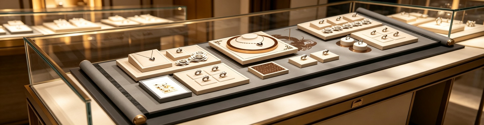
It bakes "ease of use" into structure. For opening, prefer single-hand magnetic closures, damped hinges that hold the lid, and large pull-tabs or tear notches, with opening force kept under 10 newtons. For grip, winged or textured caps increase the graspable surface by 40–60%, helping weaker hands. For readability, key text should be at least 12 pt in a sans-serif face, with contrast of 7:1 or higher (WCAG 2.1 sets 4.5:1 as the floor; packaging is often read in dim light, so aim higher) and avoid all-capital body text. For touch, embossed marks or raised dots show where and how to open, so an older person can "feel" the mechanism at 100 lux. New cues help too: NaviLens high-contrast codes can be read by a phone camera from up to 3 meters away versus about 30 cm for a QR code, and Microsoft's Xbox Adaptive Controller proved one-hand unboxing with loop pulls works for limited dexterity. The point is not more decoration but clearer signals. Practical mechanics back this up: flip-top caps can drop opening force to 3–5 newtons, and Arthritis Australia's accessibility ratings reward larger grab surfaces and legible fonts—proof that the cheapest improvements are often structural, not decorative. On the regulatory side, the EU Accessibility Act has applied since 28 June 2025 and France's AGEC law already requires Braille or tactile identification on some packaging; the global senior-friendly packaging market was about USD 5.27 billion in 2025 and is forecast to reach USD 8.75 billion by 2035, a 5.2% CAGR. Accessibility has moved from goodwill to business.
Q4: Why does minimalist premium packaging appeal more to older customers?
This is the age-friendly version of the familiar truth that high-end, simple jewelry packaging wins customers—call it the accessibility argument. Gifts to parents and grandparents put older people on the receiving end. Minimalism means large type, high contrast, a single opening motion, no nested layers; it hides nothing with decoration and pushes all the tolerance into structure itself—fold edges within 0.2 mm, batch color differences obvious at a glance. An older hand with reduced strength and weaker vision struggles far more with a heavily embossed, multi-layer, gold-foil case that is "hard to see where to start, hard to twist open." Quantitatively, one-step opening beats three steps, and one-hand opening beats two-hand twisting; a brand confident in minimalism backs it with measurable numbers—fold tolerance, hinge cycles, lining rebound. Shenzhen Junyimei shifts budget from surface ornament to structural tolerance, which happens to match what older hands need; a jewelry box that opens, reads and stays recognizable is the most practical respect you can show an elder. A heavily layered, ornate case also raises cognitive load: an elder must decide where to start, which flap folds, which ribbon to untie. Minimalism removes those micro-decisions, leaving one obvious action. That is why the same design principle that reads as "refined" to younger buyers reads as "considerate" to older ones.
Q5: How should pouches and certificates fit older users?
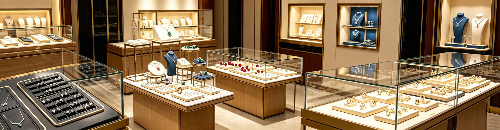
Memory and vision change with age, so packaging must keep working after leaving the store. An opaque, reusable pouch printed with one clean mark costs a few to a dozen yuan, preserves the surprise and remains a "recognizable container" on someone else's dresser; certificates, warranty cards and numbered tags should use large type and a fixed slot so they are still identifiable a decade later. A jewelry box custom-designed with a document pocket turns a gift box into an archive. For low-vision users, a QR-to-audio bridge or NaviLens tag can read the certificate aloud, so "finding and understanding" extends to those who cannot read fine print at all. Tactile identifiers help too: brands like L'Oréal have experimented with embossed codes so visually impaired users can tell shampoo from conditioner by touch—the same logic lets an elder distinguish a pouch's orientation or a box's lid without sight. For older recipients, the package does not end when opened—it ends when, years later, it can still be found and understood.
Q6: Should counters and display props also be age-friendly?
Yes, and the silver cohort is highly sensitive to in-store service. The counter should let people "see clearly and hold steadily": display props and display stands should use low-reflection matte materials rather than mirror acrylic that flashes light tubes into the customer's eyes; the try-on table should sit in the 1.2–1.6 m golden band with a magnifier nearby; lighting should reach CRI 95+ with enough intensity but controlled glare (UGR under 13); small price tags should move to zoomable screens. Inclusive design also helps the so-called average customer—everyone appreciates a box that does not require a knife, and parents with children or anyone with a temporary injury benefits equally. Building for the oldest user improves the experience for all. When an older customer can open the box and read the tag by themselves, that dignity is the brand's most tangible word of mouth. Regulation is pulling the whole market this way: as the EU Accessibility Act raises the baseline, suppliers that already design for limited dexterity will simply meet the new bar without re-engineering, turning an ethical choice into a sourcing advantage.
This is original content. Copyright belongs to Shenzhen Junyimei.
Junyimei — present every jewel and timepiece at its best.
一盒珠宝送到长辈手里,拆不开的尴尬,往往比盒子本身更先被记住。当礼赠对象常常是父母、祖辈,包装的"易开、易读、易留存"就成了真实需求,而不只是体面。
问1:为什么珠宝品牌现在要认真看待"长辈拆不开盒子"这件事?
答:这不是小众需求。截至2025年末,中国60岁及以上人口已达3.2亿,占总人口23%,预计2035年超过4亿,银发经济规模有望突破30万亿元。在银发族消费品类偏好里,黄金珠宝长期排在前列——对他们而言,买金银珠宝不只是消费,更是保值与"传承"的载体,且对品牌力和线下服务高度敏感。更关键的是购买力:银发世代(55岁以上)掌控着超过70%的可支配财富,崇尚永恒设计与传承价值;在X世代及婴儿潮一代(45岁以上)中,20%的人对未来支出态度积极,而Z世代这一比例仅4%。据2026年阿里研究院数据,"品质引领型"银发群体占21%,却贡献了74%的银发消费额,其中旅游、珠宝类高阶精神消费占比超过10%。当珠宝礼赠的对象常常就是父母、祖辈,"盒子能不能轻松拆开"就从锦上添花变成了真实需求。
问2:难开的包装到底有多普遍?
答:比想象中严重。英国消费者组织Which?调研显示,约三分之二的人定期遭遇所谓"wrap rage"(包装怒),40%的人曾在开包装时受伤,四分之一的人经常需要别人帮忙开罐开盒,更有五分之一的人因为包装太难开而干脆不买某类产品。面向50岁以上读者的Yours杂志调查更极端:99%的受访者认为现在的包装比十年前更难开,97%嫌过度包装太多,80%对塑料包装感到愤怒,71%在开食品包装时受过伤。诺丁汉大学研究指出,有超过6万人因难开包装送医;澳大利亚关节炎协会的数据点出本质:该国640万有关节炎或残疾、700万在50岁以上、170万存在视力问题,几类人群叠加意味着大约每两个人中就有一人在开包装这件事上受限。如果一只奢华珠宝盒也要靠剪刀才能打开,长辈只会默默放弃——而放弃的往往是复购。
问3:适老化的珠宝包装具体该怎么做?
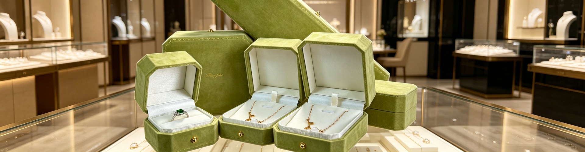
答:核心是把"易用"写进结构。开合上,优先磁吸单手可开、带阻尼的铰链让盖子停住、配大尺寸拉舌或易撕口,开合力控制在10牛以内;握持上,翼形或带纹理的盖面能把可握面积增加40%到60%,对握力下降的手更友好;可读性上,关键文字不小于12磅、用无衬线字体、文字与底色对比度做到7:1以上(WCAG 2.1最低要求4.5:1,包装因常在昏暗光下阅读应更高),避免全大写正文;触觉上,用盲压标识或凸点指明开合方向,让长辈在100勒克斯的弱光环境也能"摸到怎么开"。合规也在跟进:欧盟《无障碍法案》自2025年6月28日起适用,全球适老包装市场预计2035年达87.5亿美元——适老已从善意变成生意。这些做法不是把包装做廉价,而是让"高级"真正可被使用。
问4:高端简约的包装,为什么反而更受长辈青睐?
答:这正是"高端简约珠宝首饰品包装设计更容易被顾客青睐"在适老场景下的新解释——无障碍友好论。子女送父母、孙辈送祖辈,礼赠对象常常就是长辈。简约意味着大字号、高对比、单一开合动作、没有层层套叠;它不靠花纹遮丑,而是把全部容错交给结构本身:折边误差小于0.2毫米、批次色差摆在一起就是两个颜色一眼可见。而长辈手力下降、视力减弱,一只满版烫金、多层盒盖的繁复盒子,反而"看不清从哪开、拧不动盖子"。量化地说,一步到位的开合比三步省力,单手可开比双手拧更友好;敢做极简的工厂,底气在折边公差、铰链寿命、内衬回弹这些可测的数字上。深圳骏依美把预算从表面花纹挪到结构公差,恰好与长辈"用得顺手"的需求重合。
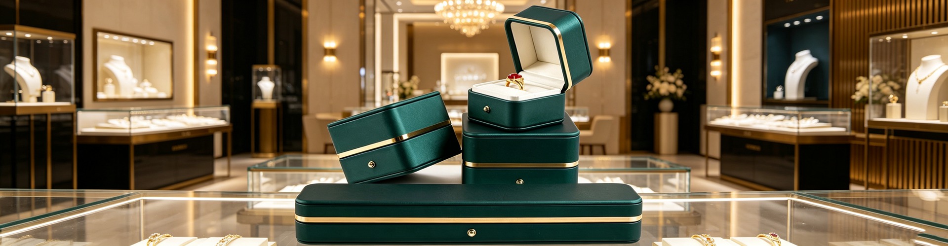
问5:首饰袋和证书,该怎么配合长辈的使用习惯?
答:长辈的记性和视力都在变化,包装要在"离店之后"继续发挥作用。不透光、可复用的首饰袋只印一枚干净标识,价格从几元到十几元,既保住礼物的悬念,又让盒体在别人家梳妆台上是"可辨认的容器";证书、保卡、编号卡用大字号、独立固定位,十年后翻出来仍认得是哪件;饰品包装盒和珠宝盒定制时预留证书位,盒子就从一个礼盒变成一份档案。对长辈来说,包装的终点不是被拆开,而是多年以后还找得到、还看得懂。
问6:柜台和陈列道具,也要为长辈考虑吗?
答:要,而且银发客群对线下服务高度敏感。柜台体验要做到"看得清、拿得稳":珠宝陈列道具和珠宝展示架尽量用低反光的哑面材质,避免镜面亚克力把灯管照进顾客眼睛;试戴台落在1.2到1.6米的黄金带,旁边放放大镜;灯光显色指数CRI不低于95、照度足够但控制眩光(UGR小于13);价签字小就改用可放大的电子屏。适老不是单独开一条产品线,而是把"所有人都方便"做进标准——当长辈愿意自己拆开、自己看清,那份体面就是品牌最实在的口碑。
本文为原创内容,版权归深圳骏依美所有,转载请注明出处。
骏依美——让每一件珠宝与腕表,都被更好地呈现。