The Spot and the Piece: How Counter Lighting Works with the Display射灯与展品:珠宝柜台的光影配合
On a jewellery counter, lighting is not for illumination - it is for direction. Which piece the customer sees first, which piece looks more expensive, and which piece quietly recedes into the background - all of it is a scene staged by spotlights working with the goods. Spotlights and exhibits are bound together: move the light and the exhibit changes; change the exhibit and the old lighting plan must follow. Understanding how spotlights and exhibits cooperate is a shortcut to raising the whole counter to the next level, and one of the most overlooked disciplines in many stores.
Set the Light First, Then Place the Goods
The right order is to think about lighting first, then arrange the goods: hero pieces belong where the spotlights are most concentrated, so the beam lands on the piece itself rather than on the corner of a tray; volume sellers sit in the secondary bright zone, looked after by spill light; traffic pieces may sit at the edge of the beam, using a bright-to-dark transition to draw the eye along the light. Light comes before goods; the position of the beam defines the shape of the golden zone. On a hero spot, keep the beam tight on the ring face so both diamond and setting sit in the light; for a bangle display, a slightly larger beam lets the whole piece glow. Before opening the counter, switch on the lights and check where the beams land, then move the goods into place - that is usually easier than endlessly adjusting the lamps.
Angle and Beam: No Glare, Better Goods
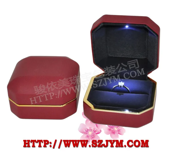
The angle of a spotlight matters more than its brightness. If a lamp shines directly into a customer's eyes, no amount of brilliance will hold their attention. Keep spotlight angles within about thirty to forty degrees, so the beam slants onto the piece instead of into the face. Beam size should also match the exhibit: a beam one step larger than the piece leaves dark room around it, and the piece looks as if it stands under a spotlight; a beam too large wastes light on the tray and empty space, diluting the brightness; a beam too small leaves the piece half-lit and half-dark, which reads as poor workmanship. Also avoid having two rows of lamps sandwich an exhibit into a thin bright slit - it tires the eyes and flattens the piece. When adjusting lamps, kneel to the customer's eye level and test: whether it glares and whether the goods shine will be obvious at once.
Light Ratio and Lining: Let the Piece Jump Out of the Dark
A good-looking exhibit is half light, half darkness. The spotlight brightens the piece, and the surrounding darkness gives that brightness weight - that is light ratio at work: when the illumination on a hero spot pulls away from the ambient level, the piece's outline stands up at once. The lining colour decides how the light lands: deep velvet absorbs light and suits silver and diamonds that need a cool feel; warm velvet reflects softly and flatters gold. Once the ratio is pulled apart, watch the counter glass - a reflection can cut the piece in two, so check the lamps through the glass and nudge the angle wherever it reflects. A piece's expensive look often comes precisely from that contrast of bright and dark.
Colour Temperature and Rendering: Warm for Gold, Cool for Diamonds
The colour temperature of a spotlight decides the complexion of the goods. Warm-toned pieces such as yellow gold and rose gold suit warmer light; if the temperature drops too low, the gold's richness is flattened. Diamonds, platinum and silver prefer cooler, whiter light; a higher temperature brings out fire and sparkle. Even more critical is the colour rendering index: poor rendering makes it hard to see the true colour of a gem - white diamonds look yellow, jade looks grey. The pricier the piece, the more it fears distortion. On a counter, choose lamps with high rendering; better a little dimmer than a little off-colour. When mixing fixtures, keep the colour temperature consistent across zones - two tints in one cabinet tell customers at a glance that the store is not meticulous.
Light Follows the Goods: Keep It Refreshed
Lighting plans are never set-and-forget. When new season stock arrives and the hero position changes, re-aim the beam at the new highlight; lamps age over time, fading and drifting in colour temperature, so exhibits grow dull - replace them in time. Set aside a few minutes each week before opening to walk the light: which lamp is out, which beam has drifted, which pane of glass reflects. Log them and make light care as routine as tidying the goods. The lamp is the most talkative display tool on a counter, and the exhibit is its microphone - when light and goods are matched, no word is needed; the customer's eyes have already spoken for you.
Lighting cooperation is a required course in jewellery display. Shenzhen Junyimei focuses on jewellery display and counter props, planning light positions, angles and cabinet coordination together. Welcome to discuss solutions based on your counter types and goods.
Original statement: This article is original by Shenzhen Junyimei (lbobo.com). Credit appreciated when sharing. Professional jewellery display props, welcome to visit: https://www.lbobo.com
珠宝柜台里,灯光不是用来照亮的,而是用来导演的:让顾客先看见哪件货、让哪件货显得更贵、让哪件货安静退到背景里,都是射灯配合展品摆出来的一场戏。柜台里的射灯和展品彼此绑定——灯位变了,展品的观感就变了;展品换了,原来的灯光方案也要跟着调整。把射灯与展品的配合理清楚,是让整柜货品上一个档次的捷径,也是很多门店最容易忽略的功夫。
先定光,再摆货
正确顺序是先想清楚灯光,再安排货位:主推款要放在射灯最集中的位置,让光斑正好落在货品上,而不是落在托盘的边角;走量款放在次亮区,用余光照顾;引流款可以放在射灯边缘,制造明暗过渡,吸引目光循着光看过去。灯在货先,光斑的位置决定黄金位的形状:主推位上的戒指,光斑要收在戒面上,让钻石和戒托都处在光里;手镯摆件的光斑可以稍大,让整只镯子都亮起来。开柜前先点灯看一遍光斑落点,再挪货就位,往往比反复调灯更省事。
角度与光斑:灯光不刺眼,货才好看
射灯的角度比亮度更关键。灯具直射顾客眼睛,再亮的货也看不进去;射灯角度通常应控制在三四十度以内,让光束斜着打向展品而非直冲人眼。光斑大小也要配合展品:光斑比货品大一圈,四周留出暗部,货品就像站在聚光灯下;光斑太大,光被浪费在托盘和空处,亮度被摊薄;光斑太小,货品一半黑一半亮,反而显得做工粗糙。柜台里还要避免上下两排灯把展品夹成一道亮缝,那样顾客看着累,货品的立体感也出不来。调灯时蹲到顾客的视线高度看一眼,刺不刺眼、货亮不亮,一试便知。射灯的高度也值得留意:灯位太高,光斑大面积散开,货品缺乏聚焦;灯位过低,光束又容易在玻璃上留下强反光,压低一点再做微调,通常能找到合适的高度。
光比与衬底:让货从暗处跳出来
展品好看,一半靠光,一半靠暗。射灯把展品打亮,周围的暗部让亮处更有分量,这就是光比的作用:主推位的照度与柜内环境光拉开差距,货品的轮廓会一下子立起来。衬底的颜色决定光打上去的效果:深色绒面吸光,更适合衬银色、钻石这类需要冷感的货;暖色绒面反光柔和,配金色更见温润。光比拉开后,还要注意别让柜门玻璃反光把货品切成两半,隔着玻璃看灯位,哪里反光就微调哪只灯的角度。货品的贵气,常常就是从这一明一暗的对比里透出来的。
色温与显色:金要暖,钻要冷
射灯的色温决定货品的肤色。金色、玫瑰金这类暖色货品适合用偏暖的光,色温低了,金子的韵味被压住;钻石、铂金、银饰适合用冷白一点的光,色温高了,火彩和闪烁更明显。更关键的是显色指数:显色不足的灯光会让人看不清宝石的真实颜色,白钻看出发黄、翡翠看出灰暗,越是贵货越怕失真。柜台里的灯,显色指数要往高里选,宁可暗一点,不能色偏一点。混用灯具时还要留意各区的色温是否一致,一柜灯两种颜色,顾客会明显觉得这家店不讲究。
灯光跟着货走,常调常新
灯光方案不是一劳永逸的。换季上新时,主推位换货,光斑就要重新对准新货的亮点;同一只灯时间久了会光衰、色温漂移,展品越看越暗淡,要及时换灯补位。每周开柜前花几分钟巡一遍光:哪只灯不亮了、哪个光斑歪了、哪块玻璃反光了,顺手记下来,让灯光保养和货品整理一样形成习惯。灯是柜台里最会说话的陈列工具,而展品就是它的话筒——灯与货配好了,一句话都不用说,顾客的眼睛就已经替你开口。
光影配合是珠宝陈列的必修课,深圳骏依美专注珠宝陈列与柜台道具,灯光点位、角度与展柜配合同步规划,欢迎结合柜型与货品咨询配套方案。
原创声明:本文由深圳骏依美(lbobo.com)原创,欢迎转载,请注明出处。专业珠宝陈列道具,欢迎咨询:https://www.lbobo.com