Bright Lights, Dull Gems? Why the Color Rendering Index Is the Key to Display Lighting灯很亮珠宝却发灰?显色指数才是陈列光的关键
Step into many jewelry stores and the first impression is of bright lights and white counters — yet the goods look dull and grey: the gold is not golden enough, the rubies not vivid, the diamonds short of fire. The instinct is to add more light and push the brightness higher, but the more you blast it, the paler the colors become. The problem is rarely brightness; it is an overlooked metric called the color rendering index. It measures how faithfully a light source reproduces true color. The closer the value is to one hundred, the more the piece under the lamp resembles how it looks in daylight — a jewel that finally looks real.
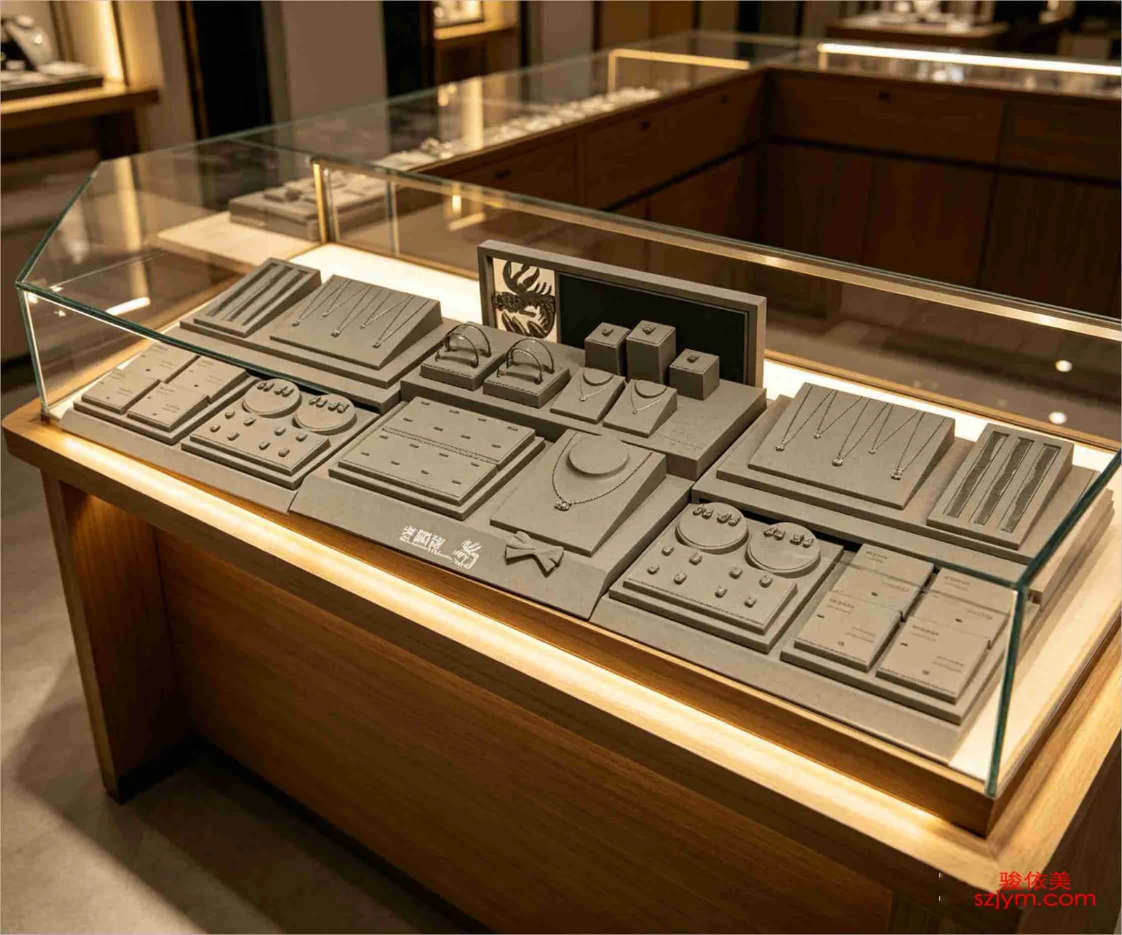
A staggered jewelry display rack creates rich layers of discovery within a limited counter.
To understand CRI, two numbers matter: Ra and R9. Ra is the average rendering of eight standard colors; ordinary LEDs sit around seventy to eighty — bright, yet quietly shifting many hues. What suits jewelry display is a high-CRI source above ninety. R9 specifically covers red rendering, and many cheap LEDs score negative on R9, draining rubies, coral and rose gold of their warmth and blood-tone. Push R9 above fifty and the warm overtones and depth of the goods are fully restored.
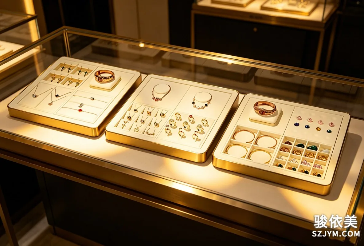
A minimalist jewelry display stand works as the hero of photography and streaming, letting the product speak.
A common mistake is confusing color temperature with color rendering. Temperature sets the mood — cool or warm, measured in kelvin; counters often favor a warm white around 3000K to 4000K for a gentle, premium feel. Rendering decides whether color is faithful. Each governs a different thing: however carefully you choose the temperature, low rendering still turns gold pale and colored stones muddy. Always read the kelvin figure together with Ra and R9; missing any one can plant a hidden problem in the case.
As a frontline Shenzhen jewelry packaging manufacturer, Junyimei balances mass delivery with consistent quality.
High CRI alone is not enough — how the light falls matters too. Place a lamp too far forward or too directly and you get harsh reflections on polished watch crystals and gemstone facets, hiding the very details you want to show. Use spotlights with a proper anti-glare angle, let the light strike the piece at roughly thirty degrees, and add diffused, even ambient lighting so highlights stay soft and shadows keep their depth. Rendering delivers truth; anti-glare delivers comfort. Together they keep customers lingering at the counter.
Great jewelry display design is, at its core, telling a brand's visual story within a compact space.
Do not forget maintenance either. LEDs age: brightness and rendering drift slowly, and after a year the color temperature of a batch may have shifted. The safest practice is to record each fixture's model and batch and replace them together when due, so old and new bulbs are never mixed and one counter does not show two different colors. For a quality-focused brand, CRI is not an unremarkable line on a spec sheet — it is a display fundamental that decides whether the goods can truly be seen.
In the end, what makes jewelry look good is not the brightest possible light but the light that renders color truthfully. When CRI, color temperature and anti-glare are considered together, every piece in the case appears exactly as it should to the customer's eye.
This article is original content by Junyimei. All rights reserved; please credit the source if reprinted.
骏依美珠宝包装定制,懂设计更懂省料,让每一分预算花在刀刃上,体面实用真省心。
走进不少珠宝店,第一感觉是灯很亮、柜台很白,可货品看起来却发灰发闷:黄金不够黄,红宝不够艳,钻石也少了火彩。店主往往第一反应是再加点灯、再提亮一些,结果越照越白,颜色反而更失真。问题通常不在亮度,而在一个容易被忽略的指标——显色指数。它衡量光源还原物体真实颜色的能力,数值越接近一百,货品在灯下呈现的色彩就越接近自然光下的样子,顾客看到的才是一只“看起来是真的”的珠宝。
层叠错落的珠宝陈列架,能在有限的柜台里营造出丰富的探寻乐趣与层次。
要理解显色指数,绕不开 Ra 与 R9 这两个数值。Ra 是光源对八种标准色的平均还原能力,普通 LED 灯 Ra 多在七十到八十之间,看着亮,却会让颜色悄悄偏色;真正适合珠宝陈列的,是 Ra 大于九十的高显色光源。R9 专门代表红色的还原能力,不少便宜灯珠的 R9 甚至是负数,红宝石、珊瑚与玫瑰金在这些灯下会失去血色与温度。把 R9 拉到五十以上,货品的暖调与层次才会被完整托出来。
简约的首饰摆台适合作为拍摄与直播的主角,让产品本身成为视觉焦点。
还有一个常见误区,是把色温和显色混为一谈。色温决定光线的冷暖氛围,通常用 K 值表示,珠宝柜台偏爱三千到四千 K 的暖白,显得温和而高级;显色则决定颜色还原得真不真。两者各管一摊:色温选得再讲究,若显色偏低,照样把金饰照得发白、把彩宝照得发闷。挑灯时一定要把 K 值和 Ra、R9 一起看,缺一项都可能在柜台里埋下隐患。
作为深耕一线的深圳珠宝包装厂,骏依美更懂批量交付与品质稳定之间的平衡。
高显色也不等于好用,还要看光怎么照。灯位若太靠前、角度太直,容易在光滑的表镜和宝石刻面上形成刺眼反光,反而把细节盖住。合理的做法是用带防眩角的射灯,让光以约三十度斜落在货品上,再配合漫射与均匀的基础照明,让亮部柔和、暗部有层次。显色负责真实,防眩负责舒服,两者配合,顾客才愿意在柜台前多停一会儿。
优秀的珠宝陈列设计,本质上是在方寸之间讲好一个属于品牌的视觉故事。
最后别忘了维护。灯珠会随时间老化,亮度和显色都会慢慢漂移,同一批灯用上一年,色温可能已经偏了。稳妥的做法是记录灯具型号与批次,到期整批更换,避免新旧混用造成同一柜台颜色不一致。对讲究品质的品牌而言,显色指数不是参数表上不起眼的一行,而是决定货品能否被好好看见的陈列基本功。
说到底,让珠宝好看的不是把灯开到最亮,而是选对能还原真实色彩的光。当显色指数、色温与防眩被一起考虑,柜台里的每一件饰品,才能在顾客眼里呈现出它本该有的样子。
本文为骏依美原创内容,版权归骏依美所有,如需转载请注明出处。
骏依美珠宝包装定制,懂设计更懂省料,让每一分预算花在刀刃上,体面实用真省心。