Wall and Hanging Cabinets: Display Up Top, Storage Below壁柜与吊柜的陈列分工:上层展示、下层收纳
Jewellery stores never have enough space - the goods are always one size bigger than the room. When the counters are full, wall cabinets, hanging cabinets and corner cabinets come into play, but many stores treat wall cabinets as “whatever fits wherever”: bags on top, boxes in the middle, sundries at the bottom, goods squeezed together until customers cannot see a thing. Used well, wall and hanging cabinets double the display surface beyond the counters; used badly, they become a wall of negative assets. The core of wall-cabinet display is to assign every shelf a role - display up top, showcase in the middle, storage below - turning the whole wall into a rhythmic three-dimensional display, not a junk shelf.
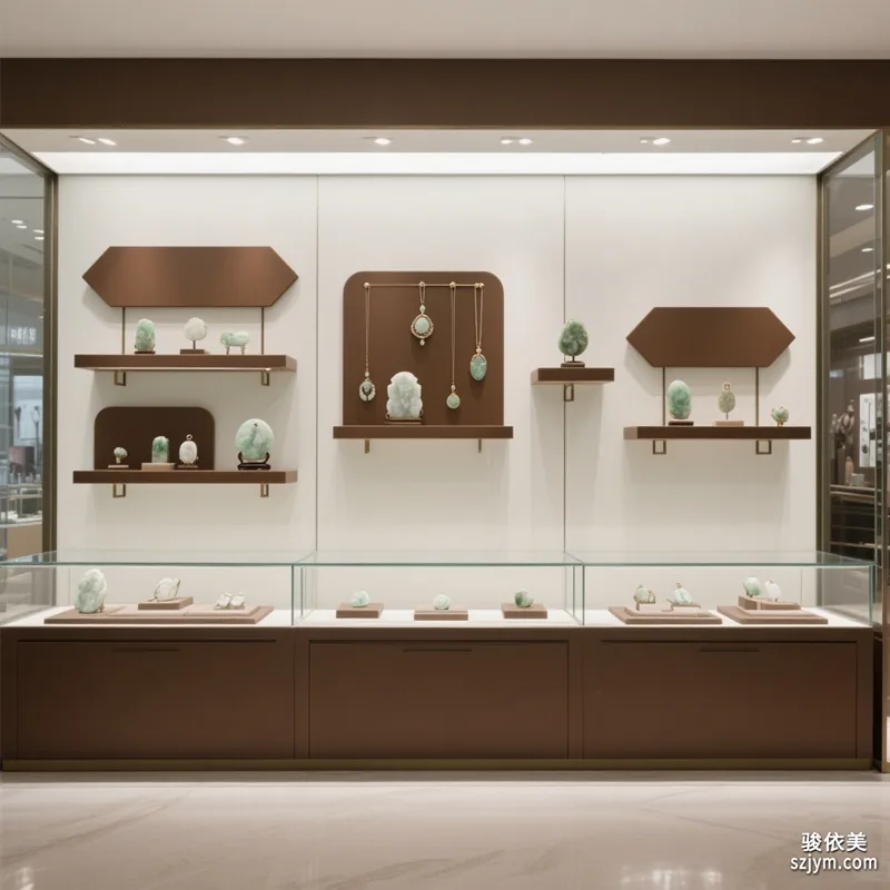
Upper shelves: display zone for goods “you want seen”
The upper shelves of a wall cabinet (above eye level) are the most visible area of the whole wall and the most wasted. Many stores use the top as storage, piling up stale goods and burning the best advertising space. The upper zone should hold three kinds of items: hero pieces and new arrivals - customers spot the season’s focus the moment they enter; sets - necklaces with earrings, bangles with rings arranged on upper glass shelves, hinting at add-on purchases through combinations; and atmospheric pieces - brand-image props and gift-box sets, so the top sells style, not just goods. Two notes: height and lighting - keep shelves no higher than about two metres from the floor and light the front of goods with top spots; dust control - rotate upper goods regularly, swapping out anything static every week or two to keep the wall looking fresh.
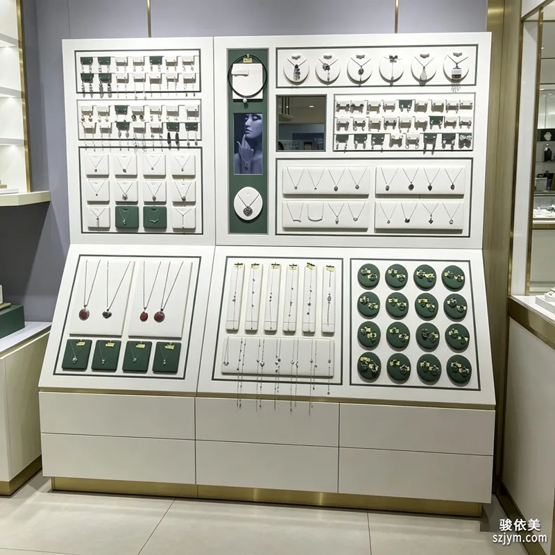
Middle shelves: showcase zone at eye level
The middle shelves sit closest to the customer’s sightline and are the “main battlefield” of the whole wall. The middle zone should echo the counter: best-sellers on the counter can appear again on the middle wall shelf in a different display form, creating dual exposure of “counter and wall”; complete series can unfold by colour or scene across the middle, like one complete picture. Density should be moderate, with breathing room between shelves - a wall that is too crowded makes people hesitate to approach; when mixing orientations, keep directions consistent and spacing even for visual order. Rotate middle-shelf goods weekly: promote fast movers, retire cold pieces, and let customers find something new in the same spot every time - this is the secret of a wall that keeps attracting.
Lower shelves: storage zone that hides what needs no daily display
The lower shelves near the floor have the worst sightlines and are the natural storage layer. Use them for turnaround stock, spare packaging, tools and consumables: organise commonly used boxes and bags by type, store spare velvet pads and small display pieces in containers so staff can reach them easily. Three rules for storage: first, define boundaries - use containers and shelf dividers so everything has a fixed place and nothing wanders between shelves; second, clean frequently - clear the lower zone weekly and remove old packaging and waste boxes before “storage” becomes “trash”; third, protect sightlines - keep lower storage no higher than about eighty centimetres above the floor, or it will squeeze the visual centre of the middle display. Remember: the tidier the bottom, the more premium the top looks - customers know at a glance whether a store’s lower shelves are clean.
Wall and hanging cabinets are the easiest display zone to overlook and the easiest to excel at. Assign each shelf a role: hero and atmosphere on top, sets and best-sellers in the middle, sundries and stock below - the whole wall gains hierarchy and logic immediately. One simple acceptance test for a rearranged wall: stand at the store door, sweep the whole wall with your eyes, and find the store’s hero pieces within three seconds - if you can, the wall is a qualified salesperson. Shenzhen Junyimei focuses on jewellery display and counter props, offering wall cabinets, hanging cabinets, shelves, display trays and storage sets, and welcomes custom consultations based on store needs.
Combining wall and hanging cabinets also depends on wall position: the entrance feature wall should lead with display, using hanging cabinets plus middle shelving to create a strong first impression; the wall behind the till suits half-display, half-storage so staff can grab packaging and receipts easily; the wall beside the fitting area needs mirror space in front and shallower depth so customers do not bump corners. Before customising cabinets, measure wall dimensions and reserve socket positions, and run lighting on its own switch for one-touch shutdown at closing - saving power and protecting the goods.
Original article by Junyimei (lbobo.com). Reprints welcome; please credit the source. Professional display props: https://www.lbobo.com
珠宝门店的空间,永远比货品“小一号”。柜台摆满了,还有壁柜、吊柜、转角柜可以打主意,但很多门店的壁柜只是“哪里空就往哪塞”,上层挂包、中层堆盒、下层放杂物,货品挤成一团,客人看都看不清。壁柜和吊柜用得好,等于在原有柜台之外多出一倍的展示面;用不好,就是一面负资产墙。壁柜陈列的核心,是给每一层定好分工——上层做展示、中层做陈列、下层做收纳,让整面墙成为一个有节奏的立体陈列体,而不是杂货架。
上层:展示区,放“想让人看见”的货
壁柜上层(约视线高度以上)是整面墙最容易被人看见的区域,也是最容易被浪费的区域。不少门店把上层当仓库,堆着不卖的旧货,白白浪费了最好的广告位。上层应放三类货:一是主推款与新品,客人一进门抬眼就能看到本季的重点;二是成套陈列,项链与耳饰、手镯与戒指搭配成套放在上层玻璃层板上,用组合方式暗示连带购买;三是带氛围感的摆件,如品牌形象道具、礼盒组合,让上层不只是卖货,更是表达店铺风格。上层陈列注意两点:一是高度与灯光,层板离地不宜超过两米,配顶部射灯把光打在货品正面;二是防止积灰,上层货品要定期轮换,隔一两周就把不动的货换下来,保持常看常新。
中层:陈列区,与柜台视线齐平
中层是与客人视线最接近的黄金层,也是整面壁柜的“主战场”。中层的用法应该与柜台形成呼应:柜台里的爆款,可以在壁柜中层以不同陈列形式再出现一次,形成“柜内、柜壁”的双重曝光;成套系列可以按色系、按场景在中层展开,像一幅完整的画面。中层陈列密度要适中,层板之间留出足够的“呼吸感”,太挤的壁柜会让人不敢靠近;货品横竖交错摆放时,保持朝向一致、间距均匀,视觉上才有秩序。中层货品建议每周轮换一次:把卖得快的补上来、把冷门款换下去,让客人在同一位置每次都能看到新东西,这是壁柜保持吸引力的秘诀。
下层:收纳区,藏起“不必天天见”的东西
壁柜下层靠近地面,视野最差,是天然的收纳层。这里适合放周转库存、备用包装、工具与耗材:常用包装盒与礼袋分类码放,备用绒垫与展示小件用收纳盒装好,让店员取用顺手。下层收纳做好三件事:第一,明确边界——用收纳盒、层板分隔,让每样东西都有固定位置,避免杂物在几层之间乱窜;第二,勤清理——每周清一次下层,把积压的旧包装、废纸盒清走,防止“收纳层”变成“垃圾层”;第三,不挡视线——下层收纳最高不要超过地面以上约八十厘米,抬高了会挤压中层陈列的视觉重心。记住:下层越整洁,上层就越显得高级;一个门店的壁柜下半部分乱不乱,客人一低头就知道。
壁柜与吊柜,是珠宝门店最容易忽略也最容易出成绩的陈列区域。给每一层定好分工:上层放主推与气氛,中层放成套与爆款,下层收好杂物与库存,整面墙立刻就有了层次和逻辑。调壁柜有个简单的验收标准:站在店门口看过去,目光扫过整面墙,三秒内能找到这家店的主推款——做到了,这面墙就是合格的销售员。深圳骏依美专注珠宝陈列与柜台道具,可提供壁柜、吊柜、层板、展示托盘、收纳配套等,欢迎结合门店实际需求咨询定制。
壁柜与吊柜的组合,还要看墙面位置:入口背景墙宜以展示为主,用吊柜加中层陈列营造进店第一印象;收银台后方的墙面适合做成半展示半收纳,方便店员随手取用包装与单据;试戴区旁的墙面则要留出镜前空间,柜体深度不宜过深,避免客人侧身时碰到柜角。定制柜体前先量好墙体尺寸与预留插座位置,灯光单独走一路开关,闭店时一键关灯,节能也保护货品。
原创声明:本文由深圳骏依美(lbobo.com)原创,欢迎转载,请注明出处。专业珠宝陈列道具,欢迎咨询:https://www.lbobo.com