The Art of Spacing on Ring Trays: Density, Gaps and Breathing Room戒指托盘的疏密之道:密度、间距与留白
One kind of counter prop can be found in almost every jewellery store, yet it is rarely treated with real care: the ring tray. Compared with display cabinets, light boxes and mannequins, trays sit quietly underneath the goods. It is easy to miss the difference: with the same twelve rings, one tray looks neat and every piece stands out, while another looks crowded, nothing but velvet and metal at first glance. The difference is not the merchandise but the spacing. How dense the rings are placed, how wide the gaps run and how much blank space is left directly decide whether customers see a well-stocked, premium counter or a messy, cramped one. Getting the spacing right is the first zero-cost upgrade for counter presentation.
Density: How Much Room Each Ring Needs
Ring tray cells usually measure between 2.5 and 4 cm square. How to choose depends first on the goods and then on the style. The most common mistake is squeezing two or even three rings into one cell, assuming more pieces mean more sales. In reality, the attention a customer pays to a single item is almost proportional to the space around it: the more open space a ring keeps, the more it reads as one important, independent piece. When rings are packed too tightly, every piece competes with its neighbours and none of them is actually seen. As a starting rule, let each ring occupy at least one full cell and align identical sizes inside the same tray. For hero or high-value pieces, allow them to span two cells or use a separate small stand — a bigger territory is the clearest way to tell customers what matters.
Gaps: Keep Rows and Columns Open
The gaps between rows and columns inside a tray matter more than most people think. If two columns of rings almost touch, the eye is forced to search through one solid mass of metal without a landing point. With proper gaps, the gaze slides along the empty lines and scans ring by ring, producing an orderly feeling of countable pieces. In practice, row gaps can be slightly wider than column gaps, guiding the eye to move horizontally first, which matches the left-to-right reading habit of most customers. Gaps should not be excessive, or the tray looks empty and the counter under-stocked. A simple reference: row gaps about one-third to one-half of the cell width, column gaps a little narrower. Aligning the cells with a ruler or by eye creates a far more stable visual result than placing pieces at random.
Blank Space: Empty Cells Are Design, Not Waste
Many store owners hate to leave empty cells and try to fill every slot. But jewellery counters carry a natural context of "less is more": an intentionally empty cell makes the piece beside it look like a true exhibit rather than street-stall merchandise. Blank space works in three ways. First, edge blanking — leave half to one cell empty at both ends of the tray so goods never touch the rim and the look breathes. Second, highlight blanking — keep a full ring of empty space around the hero piece so the space itself draws a halo around it. Third, rhythm blanking — leave one empty cell every three or four rings so the eye finds resting points and slows down. A blank ratio of about one-fifth of the tray area is a practical target: enough to lift the goods, not so much that the counter looks bare.
The ring tray is the smallest test paper on a counter. Get density, gaps and blank space right, and customers will quietly stay a little longer. Store owners can run an experiment today: take one hero ring tray and re-arrange it following "one ring per cell, aligned rows and columns, two or three empty cells", then compare how long customers pause. Display props can be added slowly, but the craft of spacing can be applied immediately — when every cell is arranged with care, the counter speaks "professional" for you. Shenzhen Junyimei focuses on jewellery display and counter props, offering trays, cabinets and display stands, and welcomes custom consultations based on store needs.
Original article by Junyimei (lbobo.com). Reprints welcome; please credit the source. Professional display props: https://www.lbobo.com
珠宝柜台里有一类道具几乎每个柜台都有、却极少被认真"摆"过——戒指托盘。相比展柜、灯箱和模特,托盘总是安静地垫在货品下面,很少有人注意到:同样的十二枚戒指,有的托盘显得整整齐齐、颗颗醒目,有的却挤成一团,一眼看去全是绒布和金属。差别不在货品,而在疏密。戒指托盘的摆放密度、格位间距与留白的比例,直接决定顾客第一眼看过去是"这家货很齐、很贵",还是"这家柜台好乱、好挤"。把疏密摆对,是零成本提升柜面质感的第一件事。
密度:一颗戒指该占多大的地盘
戒指托盘的格位大小通常在二点五到四厘米见方之间,具体怎么选,先看货品再看风格。最常见的误区,是一个格位塞进两三枚戒指,以为多摆就能多卖。事实上,顾客对单件货品的注意力几乎与周围空间成正比:留出的空间越大,越容易被看成一件独立的重要货物;摆得太密,每颗戒指都在跟旁边的戒指抢视线,结果是一颗都没被看清。入门做法是让每枚戒指至少占据一个完整格位,同一托盘内同规格货品对齐排列;如果是主推款或高值款,可以跨格位摆放,或者单独使用一只小托座,用更大的地盘直接告诉顾客这就是重点。另外,托盘密度还要跟着销量走:畅销款可以多排几枚,让顾客一眼看到热卖感;滞销或高值款则适当降低密度,用更少的数量换取更高的注目。密度本质上是注意力预算的分配,把预算花在最想卖的货上,疏密就有了生意逻辑。
间距:行与列之间要留得开
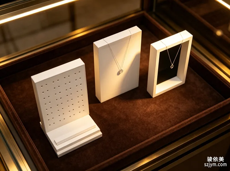
托盘内部的行列间距,比很多人想象的重要。两列戒指之间如果挤到几乎没有缝隙,顾客的视线会被迫在一整片金属里来回搜索,找不到落点;反过来,行列之间留出适当空隙,视线就能沿着空隙自然移动,一颗一颗扫过去,形成"数得清"的秩序感。实操上,行距可以略大于列距,让视线优先水平移动而不是上下跳动,这和多数顾客从左到右的阅读习惯一致。间距也不宜过大,否则托盘显得空、柜台显得货少;一个简单的参考是:行距约为格位宽度的三分之一到二分之一,列距略窄。摆放时用小尺子或目测统一对齐格位边线,比随手一放的效果稳定得多。间距还有一个容易被忽视的作用,是给销售留出手位:两指宽的缝隙,可以让销售平稳地把戒指取出放回,不碰歪旁边的货品;过密的托盘往往让取放变得紧张,顾客试戴一次,整排戒指都跟着晃动,观感大打折扣。
留白:空位不是浪费,是设计
很多经营者舍不得在托盘里留空位,总想把每一格都塞满。但珠宝柜台天生带着"少即是贵"的语境:戒指托盘里刻意留出的空位,会让旁边的货品显得更像珍品展示,而不是地摊陈列。留白的手法有三种。其一是头尾留白,托盘首尾各空出半个到一个格位,避免货品顶到托盘边缘,视觉上更透气;其二是重点空位,主推款周围留出整圈空位,用空间给它画出一道光环;其三是节奏留白,在整排戒指中每隔三到四枚空出一格,让视线有停顿点,顾客的浏览速度会自然慢下来。留白的比例建议控制在托盘面积的五分之一左右,既能突出货品,又不显得柜台空旷。留白还承担着实用职能:空出的格位放价签、品牌小卡或放大镜,顾客需要时顺手拿到,更有服务感。
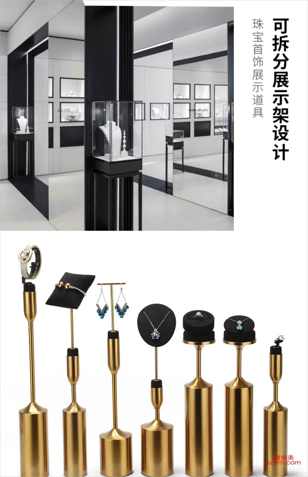
戒指托盘是柜台里最小的一张试卷,密度、间距、留白三件事都答对了,顾客在它面前停留的时间就会悄悄变长。建议经营者今天就做一次实验:选一只主推托盘,按一颗一格、行列对齐、留出两三处空位重新摆一遍,对比顾客驻足情况。陈列道具可以慢慢添,疏密的功夫却可以立刻做——把每一格都摆出讲究,柜台自然会替你说出专业二字。深圳骏依美专注珠宝陈列与柜台道具,可提供托盘、展柜、展示架等全套陈列配套,欢迎结合门店实际需求咨询定制。
原创声明:本文由深圳骏依美(lbobo.com)原创,欢迎转载,请注明出处。专业珠宝陈列道具,欢迎咨询:https://www.lbobo.com