Display Prop Plans: Fix the Hero Position First, Then Build the Layers陈列道具设计方案:先定柜台主推位,再铺一层二层三层
When I visit stores that sell well, the counters are rarely brimming with goods. The props are sparse, the layers are clear, and a customer who walks in understands within half a second what this counter wants to sell. That half second is the job of the display prop plan. Too many plans start with the counter itself — how many shelves, how many grids, fill the space first, worry about the selling logic later. The direction is wrong. A gold counter is not a storage shelf; it is a one-page ad printed fresh every single day. The plan should first decide the hero position, then lay out the layers around it, and only then worry about which tray goes where.
Step one, fix the hero position. The hero position is where the counter wants the customer to stop first. Judge it with three things: line of sight, direction of foot traffic, and light focus. A typical standing counter carries its natural vision zone at chest height, roughly the third shelf from the top, and a seated counter zone sits a little lower; this is the gold zone. Traffic decides the angle: when the flow enters from the left, pull the hero position toward the right, facing the walk-in route, so every customer sees it the moment they arrive. Avoid two spots while you are at it: the far hinge corner of the counter, which customers skim past, and the area exactly opposite the cash desk, where eyes keep drifting to the till. Light takes the final vote: the hero position is exactly where the track light spot lands, usually a warm spot about thirty-five to forty centimeters wide, bright enough to outline the piece and dim enough not to burn the velvet. A plan without a hero position is a plan without a focus — the goods all get light, and none of them shine.
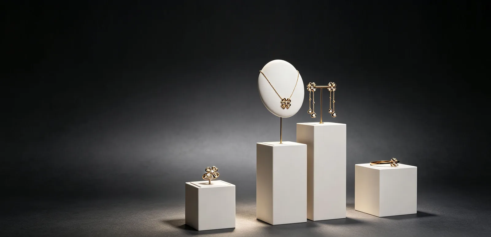
Step two, build the supporting layers. Once the hero is set, the layers get a hierarchy. The second position sits beside or below the hero, holding bestsellers and higher-margin items; it lowers the drama — flatter trays, uniform height, visible but not competing. The third layer sits further down or at the sides, holding sets, spare stock and atmosphere pieces; here props may repeat and crowd, because nothing here fights for the first glance. Density does the work for the hierarchy: the hero layer stays sparse, one piece at a time, letting the eye land; the supporting layers stay orderly, letting the eye pass. Sparse where you want attention, dense where you want depth — that is the whole trick of layering. Keep the gap rules too: rings get at least a finger-width between slots, pendants get spaces wider than the piece itself, and no shelf should ever show its painted back panel through a gap. During festivals the hero and the second position swap roles, and the point map should mark those two positions clearly so the swap takes two minutes, not half a morning.
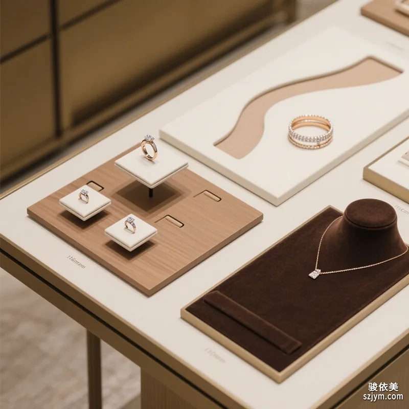
Step three, give every layer the right prop furniture. The hero position gets the props that move: angled trays that lift the ring face, small easels that stand a necklace up, risers that bring a brooch to eye level. The supporting layers get the calm props: nesting trays, compartment boxes with generous slots, low trays holding neat rows. The third layer gets the practical ones: drawer trays under the counter, translucent boxes in the back row, so stock is visible without stealing the front view. On a real counter the split looks like this: the hero layer carries one or two statement pieces, the second layer carries eight to twelve bestsellers in orderly grids, the third layer carries the sets and the restock trays. Every prop earns its place by the job it does — drama, order, storage — and when a shelf still feels empty, adjust the spacing before you add another box. Match the velvet to the goods too: white gold on grey-black, gold on beige-camel; the hero layer may use a slightly finer velvet, since it carries the goods that get looked at the longest, and it deserves the best material.
Step four, put it on a counter point map. A good prop plan always carries one sheet: a face-on drawing of the counter with every layer's height, shelf gap, prop size and light angle marked. The hero position gets one strong tag, the supporting layers get their dimensions, and the plan lists exactly which tray goes on which shelf. A useful map carries four sets of numbers: counter height and depth, each shelf's net display height, each tray's length and width, and the light spot's position and angle. Write the edition and the date in the corner of the map, and keep the old ones for reference, because every change in traffic or promotion teaches something the next plan should use. With the map in hand, a shop assistant arranges the whole counter in ten minutes; without it, every promotion means rebuilding the counter from scratch. The point map is the actual delivery of the plan — it is what the counter owner keeps after the installer leaves.
Two common mistakes, finally. Mistake one: the hero position must hold the most expensive piece. Wrong — the hero position holds the piece you most want the customer to meet, often the margin driver or the seasonal focus; the counter wants that first-glance sale, and price is the second sentence. Mistake two: layers are built by piling props. Piling props only builds crowding; layers are built by negative space and height difference — keep the height gap under two centimeters within a row, stagger adjacent rows, and the eye gets a rhythm. One sentence to remember: most of the craft in a prop plan goes into placement and white space, not into buying more new boxes.
Start from the hero position, then lay the layers: this one decision changes how a counter reads. The goods get a path, the light gets a focus, and the customer's first glance lands exactly where you want it. If your counter still reads flat, do not buy more props — take a piece of paper, mark the hero position, and rebuild the layers around it. That half second, every single time, is what a layer plan buys the store.
我走访卖得好的店,发现柜台很少是放得满满当当的。道具不多,层次很清楚,客人进门半秒钟就能看懂这个柜台要卖什么。这半秒钟,就是陈列道具方案要解决的事。太多方案是从柜台本身开始的——多少层、多少格、先把空间放满再说销售逻辑,方向就反了。黄金柜台不是储物架,它是一张每天重新印刷的整页广告。道具方案应该先定主推位,再围绕主推位铺层次,最后才轮到哪个托盘放哪里。
第一步,定主推位。主推位就是柜台想让客人第一眼停下的地方,判断依据有三条:视线高度、客流方向、灯光焦点。普通立式柜台的天然视线区在胸口高度,大约是从上往下第三层,坐式柜台再低一点,这一层就是黄金位;客流方向决定角度,客人从左边进,主推位就往右边偏一点,正对进门路线,一进门就看到。同时要避开两个位置:柜台的远角铰链位,客人走过去从不逗留;还有正对收银台的位置,眼睛总被收银台牵走。最后灯光拍板,主推位正上方就是射灯落点的位置,一般是一个三十五到四十厘米宽的暖色光斑,亮到把货勾勒出来,又不至于把绒面烤白。没有主推位的方案,等于没有焦点的方案,货全亮了,谁也亮不起来。
第二步,铺次推位与三层位。主推位定了,层次才有主次。次推位放在主推位旁边或下方,放畅销款和利润款,戏剧性要弱一点,托盘平一点、高度一致一点,看得见但不抢镜;第三层在更下面或两侧,放套装、备货和氛围展示,这里道具可以重复、可以密一点,反正不争第一眼。疏密配合层次:主推层货要少,一件一件摆,让眼睛落得下来;辅推层整齐规律,让视线顺利通过。想让人停留的地方就疏,想制造纵深的地方就密,铺层次的奥妙全在这句里。间距也有规矩:戒指槽与槽之间至少留一指宽,吊坠的格子要比货本身大出一圈,任何一层都不许空得露出柜底背板。每逢节日,主推位和次推位要互换角色,所以点位图上这两个位置要标得清清楚楚,换一次两分钟搞定,不用折腾一上午。
第三步,给每一层配上对的道具家具。主推位用"会做动作"的道具:斜放托盘把戒面抬起来、小立架把项链立起来、托台把胸针托到视线高度;次推位用"安静"的道具:套盘、宽槽的格子盒、摆成一排的低托盘;三层位用"务实"的道具:柜台下方的抽屉盘、后排的半透明收纳盒,存货看得见又不挡前排视线。落到实际柜台上大概是这样的配比:主推层放一两件重器,次推层按整齐的格子放八到十二件畅销款,三层放套装和补货盘。每一层的道具都按它干的活来配——负责戏剧、负责秩序、负责存储,如果某层还是显空,先调间距,别急着加盒子。绒面颜色也要跟着货走:白金配灰黑、黄金配米驼,主推层不妨用更细一点的绒,它装的货被看的时间最长,值得最好的料。
第四步,落到一张柜台点位图上。好的道具方案一定带一张图:柜台的正面图,每一层高度、层间距、道具尺寸、灯光角度全部标注。主推位打一个重点标,次推层标尺寸,图上一一写明哪个托盘放哪一层。实用的点位图要带四组数字:柜台的长宽高、每一层的净展示高度、每个托盘的长宽、灯位与照射角度。图的角落写上版本号和日期,旧图留着,因为每次客流变化、每次大促都会总结出新经验,下一次方案用得上。有了这张图,店员十分钟摆完一柜;没有这张图,每次促销都要重新摆一遍。点位图才是方案真正的交付物,是安装师傅走后、柜台老板手里留下的东西。
最后提醒两个最常见的误区。一是"主推位一定放最贵的"——不对,主推位放的是最想让客人认识的货,可能是利润款,也可能是当季主推,柜台要的是第一眼成交,货贵不贵是第二句话。二是"层次靠道具堆出来"——靠道具堆出来的只有拥挤,靠留白和高度差出来的才叫层次:同层托盘高低差不超过两厘米,邻层之间错开摆放,视线才有节奏。记住一句话:道具方案的功夫,大多花在摆位和留白上,而不是买多少新盒子。
先定主推位,再铺层次——这一个决定,改变的是整个柜台的阅读顺序。货有了路径,灯有了焦点,客人进门的第一眼,正好落在你想让他看的地方。要是你的柜台现在读起来还是平的,别急着买新道具,先拿张纸,标出主推位,把层次围着它重铺一遍。那半秒钟,每一次都不落空,就是层次方案给店里买来的东西。