That Big Mirror Is Quietly Leaving the Watch Counter那面大镜子,慢慢从腕表柜退场
A few years back, a watch counter without a wall of mirrors felt like a small shop. Go into client stores now and six or seven out of ten have taken that mirror down, replacing it with matte velvet or a lacquered back panel. It is not a trend swing — it is years of feedback adding up.
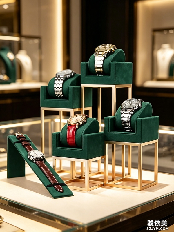 The first trouble with a mirror wall is glare. The most valuable part of a watch is its dial, yet once you mount a mirror, the spotlight hits the glass and bounces back; a customer leans in to read the watch and meets a sheet of white light first. The window stage CH4 we build for clients uses a deep-blue velvet base with a matching velvet mannequin and a bronze geometric frame — no big mirror at all. The velvet absorbs light, the metal frame finishes the edge, and the dial actually reads. The old full-wall mirror was chasing 'looks bigger, looks more,' and mostly it hid the watches.
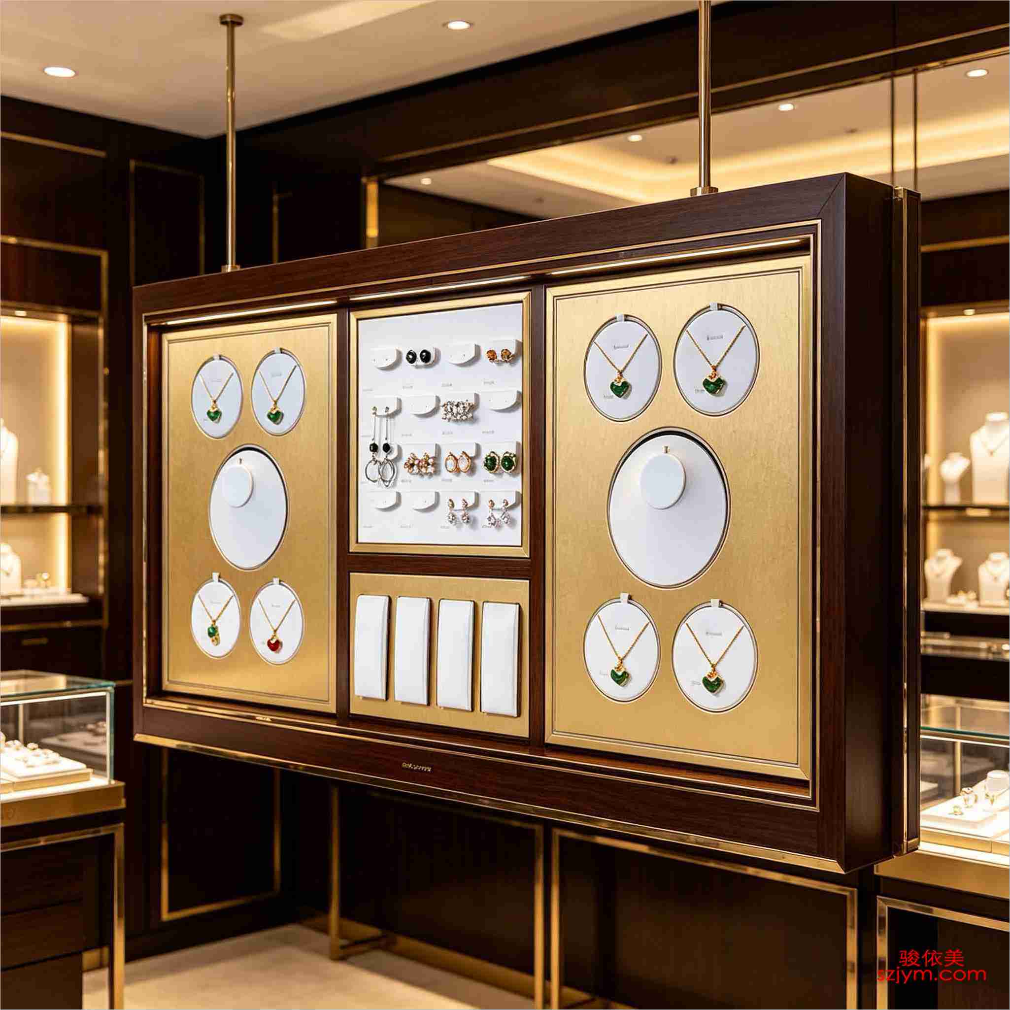
The second trouble is cheapness. Mirror edges go dark with age, fingerprints never fully wipe off, and the customer's own reflection steals attention from the watch. Swap in a matte background and the focus slides onto the timepiece. The diamond-platinum-K-gold display set DJ51 — premium grey with champagne gold, a triple module of round and oval shapes with a brand panel in the middle — speaks through material and zoning, not through reflection. One store held onto its mirror wall until a big-promo hero piece came back from the photographer as nothing but light spots; it swapped the mirror out in the end anyway.
The first trouble with a mirror wall is glare. The most valuable part of a watch is its dial, yet once you mount a mirror, the spotlight hits the glass and bounces back; a customer leans in to read the watch and meets a sheet of white light first. The window stage CH4 we build for clients uses a deep-blue velvet base with a matching velvet mannequin and a bronze geometric frame — no big mirror at all. The velvet absorbs light, the metal frame finishes the edge, and the dial actually reads. The old full-wall mirror was chasing 'looks bigger, looks more,' and mostly it hid the watches.
The second trouble is cheapness. Mirror edges go dark with age, fingerprints never fully wipe off, and the customer's own reflection steals attention from the watch. Swap in a matte background and the focus slides onto the timepiece. The diamond-platinum-K-gold display set DJ51 — premium grey with champagne gold, a triple module of round and oval shapes with a brand panel in the middle — speaks through material and zoning, not through reflection. One store held onto its mirror wall until a big-promo hero piece came back from the photographer as nothing but light spots; it swapped the mirror out in the end anyway.
 A matte backdrop is not a free pass, though. Hang a small watch on the deep-purple velvet prop DJ15 with only top light and the dial sinks into the dark; you need a narrow beam from the front-side to lift it out. Mirrors leaving does not mean light leaving. Small dial, dark background — when those meet, the lighting has to work harder.
The international clients we deal with now ask for the same thing more and more: no full mirror walls, a background that absorbs light, swaps easily and takes a brand mark. The practice moved from 'the bigger the better' to 'small, precise, readable.' One mirror tells the whole story of a display logic pulling back.
This is original content. Copyright belongs to Shenzhen Junyimei.
A matte backdrop is not a free pass, though. Hang a small watch on the deep-purple velvet prop DJ15 with only top light and the dial sinks into the dark; you need a narrow beam from the front-side to lift it out. Mirrors leaving does not mean light leaving. Small dial, dark background — when those meet, the lighting has to work harder.
The international clients we deal with now ask for the same thing more and more: no full mirror walls, a background that absorbs light, swaps easily and takes a brand mark. The practice moved from 'the bigger the better' to 'small, precise, readable.' One mirror tells the whole story of a display logic pulling back.
This is original content. Copyright belongs to Shenzhen Junyimei.
Junyimei — on the watch counter, let the timepiece be seen clearly before it is seen as desirable.早几年做腕表柜台,背景墙不挂一面大镜子,好像就显不出店大。现在再去客户店里转,那面镜子十家有六七家拆了,换回哑光绒布或者烤漆背板。不是流行变了,是反馈攒够了。
镜面背景的第一个麻烦是反光。腕表最值钱的就是表盘,可镜子一装,射灯打在玻璃上再反回来,客人凑近看表,眼前先是一片白光。我们给客户配的珠宝橱窗CH4,深蓝丝绒基座配同色绒面人台,外面是古铜金属几何框架背景——这套做法里压根没用大镜面,靠的是绒面吸光、金属框收边,表盘反而看得清。以前那种整墙镜,图的是“显大显多”,实际把表都晃没了。
第二个麻烦是廉价感。镜面用久了边角发黑、指纹擦不净,客户站在柜前,注意力被自己的倒影分走,表倒成了配角。换成哑光背景之后,视觉焦点自然落到表上。像钻铂钯K金陈列套台DJ51,高级灰加香槟金的三联模块,圆形、椭圆几何分区,中间嵌一块品牌屏,整组靠材质和分区说话,不靠反光撑场。也有店舍不得拆镜面,结果大促主推款反光,拍出来的宣传图全是光斑,最后还是换掉了。
也不是说绒布背景就万事大吉。深紫绒面的首饰陈列道具DJ15,挂小表款时如果只打顶光,表盘会整个埋进深色里,得从侧前方补一道窄光,把表盘拎出来。镜面退场,不等于光就能省。小表径、深色背景,这两件事碰到一起,打光反而要更讲究。
我接触的国际站客户,这两年提的需求越来越统一:别给我整大镜面,背景要能吸光、能换款、能上品牌标识。做法变了,从“越大越气派”转到“小而精、看得清”。一面镜子的事,背后是整个陈列思路的收手。
有家县城店,当初执意要整墙镜,说显得敞亮。半年后镜面下半截全是手印和蹭痕,灯一打一片花,主推的钢带表反而没人停。最后还是换成深灰绒背板,那批镜面框架当废铁卖了。背景这件事,听门店反馈比听潮流靠谱。背景板从镜面换成绒布或烤漆,省下的不只是反光,还有每周擦镜面的功夫。
本文为原创内容,版权归深圳骏依美所有。如需转载请注明出处。
骏依美——让腕表在柜台上,先被看清,再被看中。
The first trouble with a mirror wall is glare. The most valuable part of a watch is its dial, yet once you mount a mirror, the spotlight hits the glass and bounces back; a customer leans in to read the watch and meets a sheet of white light first. The window stage CH4 we build for clients uses a deep-blue velvet base with a matching velvet mannequin and a bronze geometric frame — no big mirror at all. The velvet absorbs light, the metal frame finishes the edge, and the dial actually reads. The old full-wall mirror was chasing 'looks bigger, looks more,' and mostly it hid the watches.
The second trouble is cheapness. Mirror edges go dark with age, fingerprints never fully wipe off, and the customer's own reflection steals attention from the watch. Swap in a matte background and the focus slides onto the timepiece. The diamond-platinum-K-gold display set DJ51 — premium grey with champagne gold, a triple module of round and oval shapes with a brand panel in the middle — speaks through material and zoning, not through reflection. One store held onto its mirror wall until a big-promo hero piece came back from the photographer as nothing but light spots; it swapped the mirror out in the end anyway.
A matte backdrop is not a free pass, though. Hang a small watch on the deep-purple velvet prop DJ15 with only top light and the dial sinks into the dark; you need a narrow beam from the front-side to lift it out. Mirrors leaving does not mean light leaving. Small dial, dark background — when those meet, the lighting has to work harder.
The international clients we deal with now ask for the same thing more and more: no full mirror walls, a background that absorbs light, swaps easily and takes a brand mark. The practice moved from 'the bigger the better' to 'small, precise, readable.' One mirror tells the whole story of a display logic pulling back.
This is original content. Copyright belongs to Shenzhen Junyimei.Junyimei — on the watch counter, let the timepiece be seen clearly before it is seen as desirable.早几年做腕表柜台,背景墙不挂一面大镜子,好像就显不出店大。现在再去客户店里转,那面镜子十家有六七家拆了,换回哑光绒布或者烤漆背板。不是流行变了,是反馈攒够了。
镜面背景的第一个麻烦是反光。腕表最值钱的就是表盘,可镜子一装,射灯打在玻璃上再反回来,客人凑近看表,眼前先是一片白光。我们给客户配的珠宝橱窗CH4,深蓝丝绒基座配同色绒面人台,外面是古铜金属几何框架背景——这套做法里压根没用大镜面,靠的是绒面吸光、金属框收边,表盘反而看得清。以前那种整墙镜,图的是“显大显多”,实际把表都晃没了。
第二个麻烦是廉价感。镜面用久了边角发黑、指纹擦不净,客户站在柜前,注意力被自己的倒影分走,表倒成了配角。换成哑光背景之后,视觉焦点自然落到表上。像钻铂钯K金陈列套台DJ51,高级灰加香槟金的三联模块,圆形、椭圆几何分区,中间嵌一块品牌屏,整组靠材质和分区说话,不靠反光撑场。也有店舍不得拆镜面,结果大促主推款反光,拍出来的宣传图全是光斑,最后还是换掉了。
也不是说绒布背景就万事大吉。深紫绒面的首饰陈列道具DJ15,挂小表款时如果只打顶光,表盘会整个埋进深色里,得从侧前方补一道窄光,把表盘拎出来。镜面退场,不等于光就能省。小表径、深色背景,这两件事碰到一起,打光反而要更讲究。
我接触的国际站客户,这两年提的需求越来越统一:别给我整大镜面,背景要能吸光、能换款、能上品牌标识。做法变了,从“越大越气派”转到“小而精、看得清”。一面镜子的事,背后是整个陈列思路的收手。
有家县城店,当初执意要整墙镜,说显得敞亮。半年后镜面下半截全是手印和蹭痕,灯一打一片花,主推的钢带表反而没人停。最后还是换成深灰绒背板,那批镜面框架当废铁卖了。背景这件事,听门店反馈比听潮流靠谱。背景板从镜面换成绒布或烤漆,省下的不只是反光,还有每周擦镜面的功夫。
本文为原创内容,版权归深圳骏依美所有。如需转载请注明出处。骏依美——让腕表在柜台上,先被看清,再被看中。